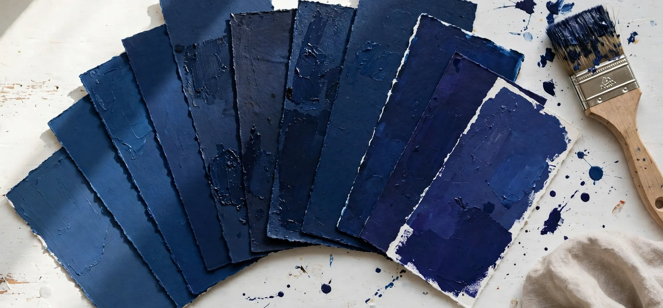
Choosing a shade of dark blue sounds simple until you stand in front of a paint chart, a fabric rail or a design palette and realise how many different dark blues there are. A shade of dark blue can be calm and classic, deep and dramatic, or bright and jewel-like, depending on its undertone and how much black, green or purple sits inside it. That is why the names matter. Navy, midnight blue, indigo and cobalt may all look similar at a glance, yet each one creates a slightly different mood and suits different jobs.
This colour guide walks through the best-known dark blue shades one by one, explains what makes each of them distinct, and shows where each one is usually used. Whether you are naming a colour for a project, describing a shade accurately to a supplier, or simply trying to tell Oxford blue from Prussian blue, you will find the differences set out clearly below. By the end, picking the right shade of dark blue should feel far less like guesswork.
What Counts as a Shade of Dark Blue
Blue sits between green and violet on the colour spectrum, and dark blues are the versions mixed with more depth and less light. A useful way to think about any shade of dark blue is to look at three things: how dark it is, what its undertone is, and how saturated it looks. Two colours can be equally dark but feel completely different because one leans green, like a deep teal-leaning blue, while the other leans purple, like indigo.
Undertone is the hidden colour that shows through, especially in natural light. A blue with a green undertone tends to feel cool, fresh and slightly aquatic. A blue with a grey undertone feels muted, calm and formal. A blue with a purple or red undertone feels warmer and richer, which is why some dark blues look almost inky while others look soft and velvety. Checking a shade against a pure white background usually reveals the undertone within seconds.
Dark Blue Versus Medium and Light Blue
Medium blues, such as sky blue or cornflower blue, carry much more light and feel open and airy. Dark blues absorb more light, which is why they read as serious, restful and grounding. In design, that depth makes dark blue a popular background colour: text and lighter elements stand out clearly against it, and the overall effect feels stable rather than busy. In clothing, dark blue has a similar reputation for looking smart without feeling as stark as black.
Popular Names for Each Shade of Dark Blue
The table below is the heart of this guide. It lists the most widely used names for a shade of dark blue, describes the character of each one, and notes where it is most often seen. Names can vary slightly between paint brands, fashion labels and digital palettes, so treat the descriptions as a guide to the general character of each colour rather than an exact match for every product.
| Shade name | Character and undertone | Commonly used for |
|---|---|---|
| Navy blue | Deep, classic blue with a neutral to slightly grey undertone | Uniforms, suits, school colours, formal branding |
| Midnight blue | Very dark, almost black-blue with a cool undertone | Evening wear, tuxedos, dramatic interiors |
| Indigo | Rich blue leaning towards purple | Denim, natural dyes, textiles, creative design |
| Cobalt blue | Vivid, saturated dark blue with a clean, bright feel | Glass, ceramics, art pigments, statement pieces |
| Sapphire blue | Jewel-toned blue, deep yet luminous | Jewellery, luxury branding, evening fashion |
| Oxford blue | Dark, slightly muted blue linked with the University of Oxford | Academic dress, traditional clothing, heritage brands |
| Prussian blue | Dark greenish-blue, intense and slightly moody | Artists paint, inks, historic pigment work |
| Royal blue (dark form) | Strong, confident blue, brighter than navy | Sportswear, flags, team colours, logos |
| Steel blue | Greyish dark blue, calm and understated | Interiors, cars, modern corporate design |
| Peacock blue | Dark blue-green with a rich, exotic feel | Accent fabrics, tiles, decorative design |
| Yale blue | Deep, dignified blue linked with Yale University | University colours, publishing, formal design |
| Space cadet and ink blue | Very dark, grey-leaning blues, close to blue-black | Digital backgrounds, stationery, modern minimal design |
A few of these names carry a story. Prussian blue was one of the first modern synthetic pigments used by artists, and its greenish depth still makes it a favourite in painting. Indigo takes its name from a traditional plant dye, which is why it is so closely tied to denim and woven cloth. Oxford blue and Yale blue show how a shade of dark blue can become part of an identity, instantly linked with a place, a team or an institution.
Where Each Shade of Dark Blue Is Used
Dark blue appears almost everywhere once you start looking for it. In fashion, navy is the traditional alternative to black for suits, blazers and formal dresses, because it softens the contrast against most skin tones while still looking sharp. Midnight blue is a classic choice for evening wear and formal jackets, where it can look richer than black under artificial light. Indigo dominates casual clothing through denim, while cobalt and sapphire tones are used for statement pieces, accessories and occasion wear.
Dark Blue in Design and Branding
Businesses choose dark blue because it is widely associated with trust, reliability and professionalism. Banks, technology firms, airlines and healthcare brands often build their palettes around navy or a similar deep tone, then add a brighter accent colour for energy. On websites and apps, a dark blue background or header can make white text easy to read and give a layout a calm, orderly feel. Designers simply need to watch contrast: very dark text on a dark blue background quickly becomes hard to read, so lighter type and generous spacing matter.
Dark Blue in Interiors and Everyday Products
At home, dark blue is used on walls, kitchen cabinets, sofas, bedding and tiles. It pairs naturally with wood, brass, white and grey, and it can make a room feel restful without feeling cold when the undertone is chosen well. In products, you will see it on cars, luggage, sportswear, notebooks and packaging, anywhere a colour needs to feel dependable and unisex. Uniforms are another major use: navies and dark blues signal authority and neatness, which is why they appear so often in schools, airlines and public services.
How to Choose the Right Shade of Dark Blue for a Project
Start with the job the colour has to do. For something formal and timeless, navy, Oxford blue or Yale blue are safe starting points. For drama and contrast, midnight blue or an ink-like blue works well, especially in the evening or on a feature wall. For energy, cobalt and sapphire tones keep the depth of dark blue while adding brightness, so they suit accents, artwork and branding that needs to stand out.
Next, test the colour in real conditions. A shade of dark blue that looks perfect on a screen can look almost black in a dim room, and a paint sample can shift noticeably between daylight and warm evening lighting. Look at a physical swatch or sample where possible, view it at different times of day, and place it next to the materials it will live with, such as flooring, fabric or metal finishes. Small test areas save expensive mistakes, particularly with paint and upholstery.
Finally, think about pairing. Dark blue sits comfortably beside white and cream for a crisp look, grey for a calm modern feel, and warm metals such as brass or copper for contrast. Greens and teals close to blue on the colour wheel create a layered, tonal scheme, while a small amount of orange or warm yellow, the colours opposite blue, makes dark blue appear even richer. Keeping the undertone consistent across the palette is the simplest way to make the result feel deliberate rather than accidental.
A practical extra step is to build a small sample set before you commit. Collect three or four candidates, perhaps navy, indigo and one brighter option, and view each shade of dark blue beside the whites, woods and metals you already own. Notice how a shade of dark blue with a green undertone can clash quietly with a purple-leaning fabric, while a shade of dark blue with a grey undertone tends to sit calmly beside almost anything. Designers often work this way, comparing real samples in real light, because the difference between two near-identical dark blues is usually an undertone difference, and undertone is almost impossible to judge from a name alone.
Frequently Asked Questions About Dark Blue Shades
What is the darkest shade of dark blue? Midnight blue and ink-like shades such as space cadet are usually considered among the darkest, because they sit very close to black. In low light they can be hard to tell apart from black, and the difference often only shows clearly in daylight or next to a true black object.
Is navy blue the same as dark blue? No. Navy is one specific, well-known dark blue with a slightly muted, formal character. Dark blue is the wider family, which also includes indigo, cobalt, Prussian blue, sapphire and many others, each with its own undertone and level of brightness.
What colours go well with dark blue? White, cream, grey and warm wood tones are the most reliable partners. Brass, copper and gold add warmth, teal and green create a calm tonal look, and small touches of orange or mustard provide strong contrast. The best choice depends on whether you want the scheme to feel calm, formal or lively.
Why do so many companies use dark blue in logos? Dark blue is commonly linked with trust, stability and professionalism, and it reproduces clearly in print and on screens. That combination makes it a popular choice for finance, technology, travel and healthcare brands that want to look dependable without looking dull.
Conclusion
Every shade of dark blue has its own personality, from the formality of navy and Oxford blue to the jewel-like brightness of sapphire and cobalt. Once you know how to read undertone, depth and saturation, the names on a chart stop being confusing and start being genuinely useful. Choose the shade that matches the mood you want, test it in real light, and pair it with colours that respect its undertone, and dark blue will rarely let you down.
For more colour naming guides, explore all colour names in one guide, compare the options in names of different blue colours, and see a neighbouring family in different shades of purple names.