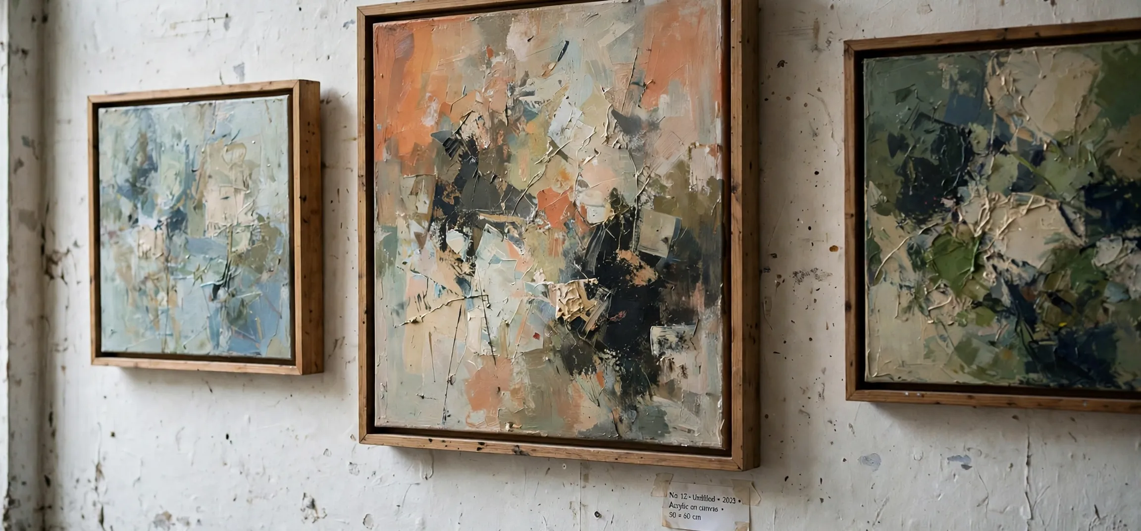
Walk into any gallery and you will notice that some artworks feel complete and harmonious, while others feel scattered, however interesting their individual parts. The difference often comes down to unity. A clear definition of unity in art is this: unity is the principle of design by which all the elements of an artwork work together to create a sense of wholeness, coherence, and completeness. It is what makes a painting, sculpture, or design feel like one thing rather than a collection of unrelated parts.
In this guide, we explore the definition of unity in art in depth, look at the techniques artists use to achieve it, examine how it relates to variety, and show how to recognise it in artworks across styles and periods.
Definition of Unity in Art: What Is Unity?
Unity, sometimes called harmony, is one of the fundamental principles of art and design, alongside balance, contrast, emphasis, movement, pattern, rhythm, and variety. While the elements of art, line, shape, colour, texture, space, form, and value, are the building blocks, the principles describe how those blocks are organised. Unity describes the overall effect when that organisation succeeds: the artwork holds together.
Think of unity as the answer to the question: “Does this artwork feel like a single, intentional whole?” A unified artwork may still contain contrasts and surprises, but those contrasts feel purposeful, contributing to the whole rather than fighting it. A work that lacks unity feels fragmented: the eye jumps from part to part without settling, and the viewer is left unsure what the work is about.
Unity is not the same as uniformity. A perfectly uniform artwork, in which every part is identical, would be boring rather than unified. Good unity allows for variety within coherence, a balance we explore below. The goal is not sameness, but a sense of belonging: every element feels as if it belongs in the work, and removing any element would diminish it.
How Artists Achieve Unity
Artists use many techniques to create unity, often combining several in a single work:
Repetition
Repeating a colour, shape, line, or texture throughout a work creates a visual thread that ties its parts together. A painter who repeats a particular blue in the sky, a garment, and a shadow creates a sense of connection between those areas, even if they are far apart on the canvas.
Colour harmony
Using a limited palette, or colours that relate harmoniously, is one of the most powerful unifying tools. A work built around analogous colours, colours adjacent on the colour wheel, tends to feel cohesive, while a work that uses every colour at full intensity can feel chaotic unless other unifying devices are at work.
Proximity and grouping
Placing related elements close together, and separating groups with space, helps the viewer perceive the work as organised. The Gestalt principles of perception, which describe how the human eye groups nearby or similar things, underlie much of this. Artists exploit these tendencies, grouping what belongs together and separating what does not.
Continuation and alignment
Lines, edges, and shapes that continue across a work, or align with one another, create a sense of flow and connection. A horizon line that aligns with a figure’s gaze, or a diagonal that leads from one element to another, binds the composition together.
Consistent style and medium
Using a consistent technique, brushwork, or material throughout a work contributes to unity. A painting in which one area is rendered photorealistically and another in loose abstraction may feel divided, unless that contrast is itself the point. Consistency of handling signals that the work is a single statement.
Definition of Unity in Art: Unity and Variety
Unity’s great partner, and its great tension, is variety. Variety is the principle that introduces difference, contrast, and interest. Without variety, unity becomes monotony. Without unity, variety becomes chaos. The art of composition lies in balancing the two.
| Too much unity | Balanced unity and variety | Too much variety |
|---|---|---|
| Monotonous, boring, predictable | Coherent yet interesting, with purposeful contrasts | Chaotic, scattered, hard to follow |
Consider a landscape painting. Unity might come from a consistent palette of greens and blues and a repeated horizontal rhythm of fields and hills. Variety might come from a single red barn, a winding path, or a dramatic cloud, elements that stand out precisely because the rest of the work is unified. The contrast works because the unity gives it something to contrast against. Remove the unity, and the red barn is just one more unrelated thing.
This balance is why unity is often described as the goal of composition and variety as its spice. A successful artwork needs both, in proportions suited to its purpose. A meditative abstract work may lean heavily towards unity, while a busy street scene may lean towards variety, but neither can abandon the other entirely.
Unity in Different Art Forms
Unity applies beyond painting. In sculpture, unity comes from the relationship between forms, materials, and the space around the work. A sculpture whose parts share a material and a rhythm of curves feels unified, even if its forms are complex. In architecture, unity comes from repeated materials, proportions, and details that make a building feel coherent, inside and out.
In graphic design, unity is essential to usability. A website or poster whose typefaces, colours, and spacing are consistent feels trustworthy and is easier to navigate. Designers use grids, style guides, and limited palettes to achieve this, and the result is a visual identity that holds across many different pages or products. For a related look at how visual consistency works in design, see our article on mean definition in maths, where consistency of method matters in a different field.
In photography, unity often comes from a consistent approach to light, colour, and subject. A photo series with a unified palette and framing feels like a coherent body of work, while a series with wildly varying styles feels like a random collection. Photographers, like painters, use repetition and colour harmony to bind their images together.
How to Recognise Unity in an Artwork
When looking at an artwork, a few questions help you judge its unity. First, does your eye move through the work in a guided way, or does it jump randomly? Guided movement suggests unity. Second, do the colours and textures feel related, or do some areas feel as if they belong to a different work? Relatedness suggests unity. Third, if you covered one element, would the work feel incomplete? If so, that element is contributing to unity.
It also helps to squint at a painting, which blurs detail and reveals the overall structure of shapes and values. A unified work usually retains a clear, coherent structure when squinted at, while a disunified work dissolves into unrelated patches. This simple trick is used by artists and students alike to check composition.
Finally, consider the work’s purpose. A work that aims to express confusion or fragmentation may deliberately avoid unity, and judging it by unity alone would miss its point. Unity is a principle, not a rule, and artists sometimes break it intentionally. The question is always whether the effect serves the work’s meaning, and our guide to the meaning of bildungsroman explores a literary form where coherence of growth is similarly central.
Definition of Unity in Art: Classroom Exercises
Students learning the definition of unity in art often benefit from simple exercises. One classic exercise is to take a magazine image, cut it into pieces, and rearrange the pieces into a new composition, noticing how unity is lost when the original relationships are broken and how it can be restored by repeating a colour or aligning edges. Another is to create two versions of the same still life: one using a limited palette of three colours, and one using every colour available, and to compare which feels more unified. These exercises make an abstract principle tangible, and they show that unity is not a mysterious quality but a result of specific, learnable decisions about repetition, colour, and arrangement.
Frequently Asked Questions
What is the definition of unity in art?
Unity in art is the principle by which all elements of an artwork work together to create a sense of wholeness and coherence, so the work feels like a single, intentional whole rather than a collection of unrelated parts.
What is the difference between unity and harmony?
The terms are often used interchangeably. Some writers use harmony to mean pleasing agreement of elements, particularly colour, and unity to mean the broader sense of wholeness. In practice, they overlap heavily, and either term is usually understood.
Can an artwork have too much unity?
Yes. Excessive unity without variety produces monotony. A work in which everything is identical in colour, shape, and texture may be unified but boring. Good composition balances unity with variety.
How do artists create unity?
Common techniques include repetition of colours, shapes, or textures; a limited, harmonious palette; grouping related elements; continuation of lines and edges; and consistent style and handling throughout the work.
Conclusion
The definition of unity in art comes down to wholeness: the quality that makes an artwork feel complete, coherent, and intentional. Artists achieve it through repetition, colour harmony, grouping, alignment, and consistent handling, balanced always against variety, which keeps unity from becoming monotony. Whether you are making art, studying it, or simply looking at it with more attention, unity is one of the most useful concepts to carry with you. It explains why some works hold your gaze and others let it wander, and it gives you a language for the difference.