The analogous definition in art is one of the first ideas every art student meets, yet it is also one of the most useful ideas a working painter, designer, or illustrator will ever learn. In simple terms, the analogous definition in art describes colours that sit next to each other on the colour wheel and therefore share a close family resemblance. Think of yellow, yellow-green, and green: they flow into one another without a sharp clash, and that gentle flow is exactly what makes an analogous colour scheme feel calm, unified, and natural. If you have ever looked at a landscape painting and felt that everything belonged together, even though you could not say why, there is a good chance you were looking at analogous colours at work.
This guide explains the idea in plain language, shows how artists use it, and gives you practical steps for trying it in your own work. Whether you paint with oils, sketch digitally, or simply want to understand the paintings you admire, the concept is easy to grasp once you can see it on the colour wheel.
Analogous Definition in Art Explained
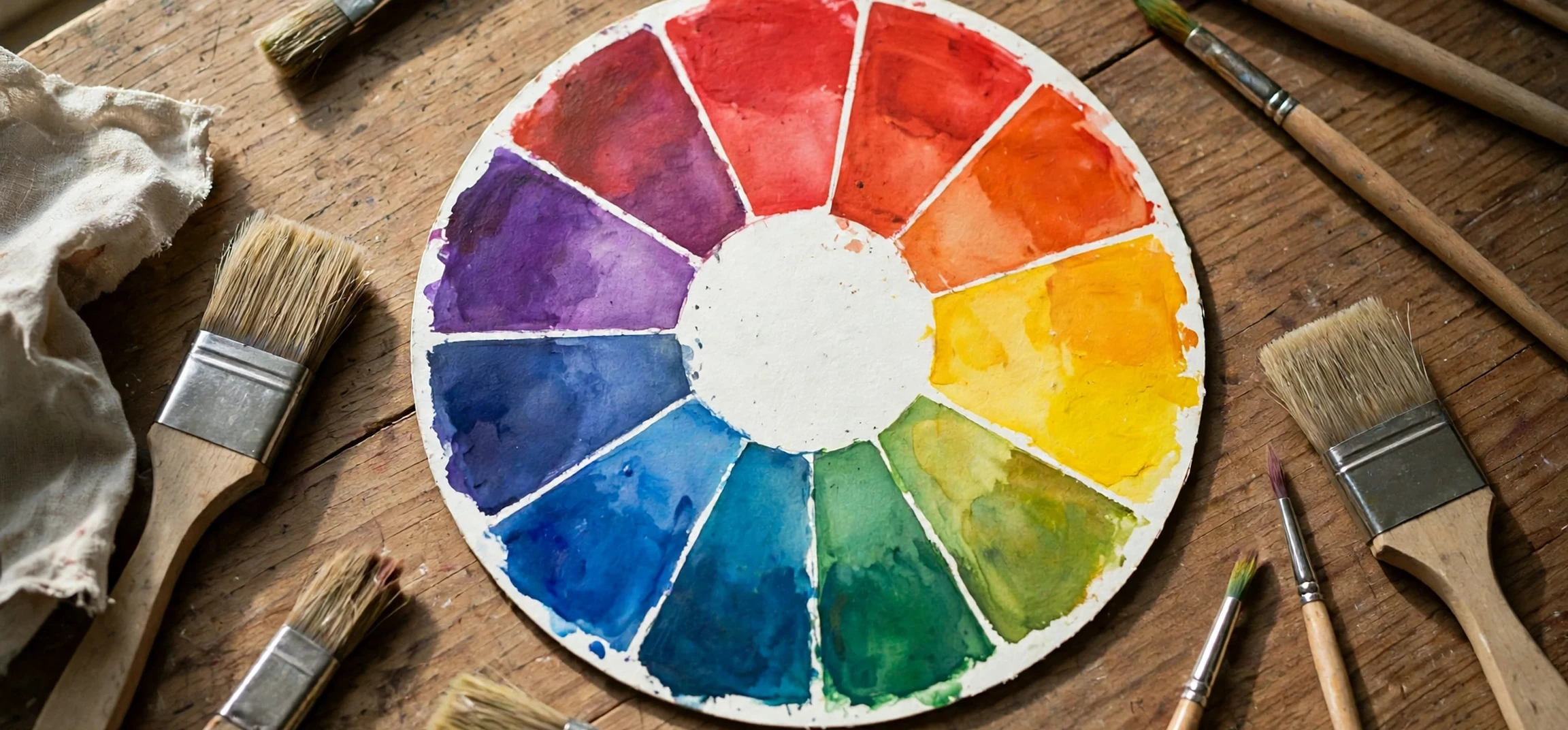
At its heart, the analogous definition in art is about neighbours. On a standard twelve-part colour wheel, analogous colours are any group of three to five colours that sit side by side. A typical set might be red, red-orange, and orange, or blue, blue-green, and green. Because these colours share undertones, they blend smoothly and create a sense of harmony rather than tension. Artists often choose one colour to dominate, a second colour to support it, and a third colour, sometimes with black, white, or grey added, to act as an accent.
The word analogous itself comes from the idea of analogy, meaning a likeness or correspondence between things. In colour theory, that likeness is literal: neighbouring colours contain some of the same pigments. Yellow-green, for example, is made by mixing yellow and green, so it naturally bridges the two. This shared DNA is why analogous schemes rarely look jarring, even when they are bold. A sunset painted in red, orange, and yellow feels vivid, but it never feels chaotic, because the colours belong to the same family.
The Colour Wheel and Analogous Groups
To find analogous colours, start with any colour on the wheel and look at its immediate neighbours on either side. That trio is your basic analogous scheme. You can extend it to four or five colours by moving one step further in either direction, although most artists stop at three or four to keep the painting from becoming muddy. The wider the group, the more variety you gain, but the weaker the sense of unity becomes, so balance matters.
It also helps to understand the three kinds of colours on the wheel. Primary colours, red, yellow, and blue, cannot be made by mixing other colours. Secondary colours, orange, green, and violet, come from mixing two primaries. Tertiary colours, such as red-orange or blue-green, come from mixing a primary with a neighbouring secondary. Analogous groups usually mix all three kinds, which is part of their richness. A group built around blue might include blue-green and green, giving you a cool, watery range that still has depth and movement.
Warm and Cool Analogous Schemes
Analogous schemes generally fall into two moods. Warm schemes use reds, oranges, and yellows, and they tend to feel energetic, sunny, and inviting. Cool schemes use blues, greens, and violets, and they tend to feel peaceful, distant, and restful. Neither mood is better than the other; the choice depends on the feeling you want the viewer to have. A painting of a desert at noon calls for warm neighbours, while a painting of a misty lake calls for cool ones. Many artists deliberately pick a warm or cool family first and only then decide on the exact colours within it.
Analogous Definition in Art in Famous Paintings
Some of the most beloved paintings in history rely on analogous colour. Claude Monet, for example, often built his water-lily paintings from blues, blue-greens, and greens, with only small touches of contrasting colour to keep the eye interested. The result feels like a real pond on a summer afternoon: everything shimmers, but nothing shouts. Vincent van Gogh used warm analogous groups in many of his sunflower and wheatfield paintings, letting yellows, golds, and oranges carry the heat of the scene.
You can see the same principle in nature photography, interior design, and even film. A forest scene in greens and yellow-greens feels believable because real forests really are built from those neighbours. A designer decorating a bedroom in blues and blue-violets is using the same idea to create a restful room. Once you know what to look for, you will start noticing analogous schemes everywhere, from book covers to advertising posters. Like other creative terms, the idea rewards a little study; readers who enjoy unpacking artistic language may also enjoy our guide to the meaning of bildungsroman, which explores another term that turns up across art and literature.
How to Use Analogous Colours in Your Own Work
Using an analogous scheme well is less about following a rigid formula and more about making a few deliberate choices. Start by choosing your dominant colour, the one that will cover the largest area of your painting or design. Then pick one or two neighbours to support it. Finally, decide where your darkest darks and lightest lights will go, because value, how light or dark a colour is, matters just as much as hue. An analogous painting with no contrast in value can look flat, even if the colours are beautiful.
A practical trick is the 60-30-10 approach. Let your dominant colour take roughly sixty per cent of the work, your supporting colour about thirty per cent, and your accent colour, which may be a neighbour or a neutral, about ten per cent. This keeps the scheme organised and stops any one colour from fighting the others. You can also vary the saturation of each colour, using a vivid version in the focal point and duller versions elsewhere, so the eye knows where to look first.
Adding a Touch of Contrast
Pure analogous schemes can sometimes feel too quiet, so many artists add a small amount of a complementary colour, the colour opposite on the wheel, as a spark. A mostly blue-green painting with a tiny touch of red-orange in one flower, for example, suddenly has a focal point. The key word is small: a little contrast wakes the painting up, while a lot of it destroys the harmony you built. Think of it as seasoning rather than a main ingredient.
Analogous vs Complementary Colour Schemes
It is easier to understand analogous colour when you compare it with its opposite. Complementary schemes pair colours from opposite sides of the wheel, such as blue and orange, and they create energy, tension, and drama. Analogous schemes do the reverse: they create unity, calm, and cohesion. Neither approach is right for every painting, and skilled artists often combine them, using an analogous family for most of the work and a complementary accent for emphasis.
| Feature | Analogous scheme | Complementary scheme |
|---|---|---|
| Colours used | Neighbours on the wheel | Opposites on the wheel |
| Overall feeling | Calm, unified, natural | Bold, energetic, dramatic |
| Best for | Landscapes, serene scenes | Posters, focal points, drama |
| Main risk | Looking flat or dull | Looking harsh or clashing |
| Easy fix | Add value contrast or a small accent | Mute one colour with grey |
Colour in music works in a similar way, with neighbouring ideas creating a mood before any dramatic change arrives; our guide to subito meaning in music looks at how a sudden shift can change that mood in an instant.
Common Mistakes With Analogous Colour
The most common mistake is using every colour at full strength. When red, red-orange, and orange are all equally vivid, the painting can feel loud rather than harmonious. Try dulling at least one colour by mixing in a little of its neighbour or a touch of grey. Another frequent mistake is forgetting value: if all your analogous colours are the same lightness, shapes melt into each other and the composition loses structure. Squint at your work from time to time; if you can still read the main shapes, your values are working.
Remembering the analogous definition in art helps here, because it insists on true neighbours rather than approximate ones. A third mistake is choosing neighbours that are too far apart. Red and yellow are not analogous on their own, because orange sits between them; a red-yellow pairing without orange is really a different kind of scheme. Keep your group tight, with each colour directly beside the next, and the harmony will take care of itself. Finally, remember that analogous does not mean identical. Slight variations in temperature, a warmer green here, a cooler green there, keep the painting lively while staying inside the family.
Analogous Definition in Art: A Quick Practice Exercise
The fastest way to make the analogous definition in art stick is to try it with a limited palette. Choose any colour on the wheel, add its two neighbours, and paint a small study using only those three colours plus white and a dark neutral. Because the analogous definition in art is built on neighbours, you will find that your mixes stay harmonious even when you push the values darker or lighter. Try the same exercise with a warm family and then a cool family, and compare the two studies side by side. The analogous definition in art becomes obvious once you see it: the warm study will feel sunny and close, while the cool study will feel calm and distant, even though both use exactly the same method. Repeat the exercise with a four-colour family, and notice how the extra neighbour adds variety but also makes the painting harder to control. That tension, between variety and unity, is the heart of the analogous definition in art, and learning to manage it is what turns a beginner’s palette into an artist’s palette.
Frequently Asked Questions
What is the analogous definition in art?
The analogous definition in art describes a colour scheme made from colours that sit next to each other on the colour wheel, such as blue, blue-green, and green. These colours share undertones, so they create harmony and a natural, unified feeling in a painting or design.
How many colours are in an analogous scheme?
Most analogous schemes use three colours, although four or five can work if one colour clearly dominates. Using more than five neighbours usually weakens the harmony and makes the scheme harder to control.
Are analogous colours warm or cool?
They can be either. A warm analogous scheme uses reds, oranges, and yellows, while a cool one uses blues, greens, and violets. The choice depends on the mood you want, and some schemes sit in the middle, around green or violet.
Can beginners use analogous colour schemes?
Yes, analogous schemes are one of the safest starting points for beginners, precisely because neighbouring colours rarely clash. They let you practise value, composition, and brushwork without fighting your palette at the same time.
Analogous Definition in Art: Why It Matters
Beyond technique, the analogous definition in art matters because it explains why some pictures feel restful and others feel tense before we have consciously analysed them. When viewers say a painting feels peaceful, they are often responding to the analogous definition in art without knowing its name, because neighbouring colours ask very little of the eye. That is why the analogous definition in art is taught so early and used so widely: it gives beginners a reliable route to harmony and gives experienced artists a calm foundation on which a single bold accent can shine. Understanding the analogous definition in art will not make every painting good, but it will stop many paintings from failing for reasons their maker cannot explain.
Conclusion
The analogous definition in art is, at bottom, a simple and generous idea: colours that live next to each other on the wheel tend to get along. That neighbourliness gives artists a reliable way to create harmony, whether they are painting a landscape, designing a room, or building a digital illustration. By choosing a dominant colour, supporting it with one or two neighbours, watching your values, and adding only a small touch of contrast where needed, you can make work that feels unified without feeling dull. The next time you admire a painting that seems to glow with quiet coherence, look closely at its palette. You will very likely find an analogous family doing the quiet work behind the beauty, and you will know exactly how to use the same idea in your own art.