If you searched for “the meaning of the colour purple”, you are asking about one of the most symbolically loaded colours in the spectrum, and the answer touches psychology, history, and everyday design. In broad terms, the meaning of the colour purple is most often associated with royalty, luxury, creativity, spirituality, and mystery. Those associations are not properties of light itself. They are cultural meanings that built up over centuries, from the rarity and cost of purple dye in the ancient world to the modern use of purple in branding, art, and personal style. This guide explains the symbolism of purple, what colour psychology says and does not say about it, and how its meanings change with shade and context.
Purple sits between blue and red on the colour wheel, and that in-between position shapes much of its symbolism. Blue is often linked with calm and stability, red with energy and passion, and purple, blending the two, is often described as balancing calm with intensity, or reason with emotion. That description is poetic rather than scientific, but it captures why purple has long been used to suggest imagination, depth, and something a little out of the ordinary. A colour that is neither warm nor cool in a simple sense invites a wider range of interpretations than a colour with a single dominant association.
The Meaning of the Colour Purple in Symbolism
The meaning of the colour purple in symbolism begins with rarity. In the ancient world, purple dye was difficult and expensive to produce. The most famous ancient purple, Tyrian purple, was made from sea snails, and producing even a small amount of dye required a great many snails and a laborious process. Purple cloth was therefore costly, and it became a marker of wealth and high status. Rulers, emperors, and senior religious figures wore purple to signal authority, and in some societies laws or customs restricted its use to the elite. That historical link between purple and power is the root of its modern association with royalty and luxury.
Over time, the royal association broadened. Purple came to suggest not only political power but also dignity, ceremony, and refinement. It appears in coronation robes, academic dress, and religious vestments in several traditions, where its richness suits formal occasions. In Christianity, purple is associated with penitence and preparation in certain liturgical seasons, as well as with royalty, because of the biblical account of a purple robe placed on Jesus before the crucifixion. In other traditions, purple carries its own distinct meanings, which is a reminder that colour symbolism is cultural rather than universal. A colour that signals mourning in one culture may signal celebration in another, and purple is no exception.
Alongside royalty, purple is strongly linked with creativity and imagination. Artists and writers have long used purple to suggest dreamlike, fantastical, or mysterious qualities, and the colour appears in descriptions of twilight skies, distant mountains, and other scenes that feel both real and unreal. That imaginative association has carried into modern branding, where purple is often chosen by companies that want to appear creative, original, or unconventional. It is also linked with spirituality and introspection in many modern wellness and artistic contexts, where it suggests meditation, wisdom, and inner life rather than outward display.
The Meaning of the Colour Purple in Psychology
Colour psychology is the study of how colours affect mood, perception, and behaviour, and purple is a favourite subject within it. Popular accounts often claim that purple encourages creativity, calms the mind, or inspires spiritual reflection. Those claims should be treated with care. Research on colour and mood is real, but its effects are usually modest, highly dependent on context, and shaped by personal and cultural experience. A purple room does not automatically make a person creative, and a purple logo does not guarantee that customers will feel luxurious. What colour can do is contribute to an overall impression, alongside shape, wording, lighting, and the viewer’s own associations.
Within that cautious frame, some patterns are worth noting. Darker purples, such as deep plum or aubergine, tend to feel rich, serious, and formal, and they are often used where a sense of quality or tradition is wanted. Lighter purples, such as lilac and lavender, tend to feel softer, gentler, and more romantic, and they are often used where calm or tenderness is wanted. Bright, vivid purples, such as violet and magenta-leaning shades, tend to feel energetic, playful, and bold, and they are often used where attention and originality are wanted. Shade matters as much as the colour family itself, and a single word like purple covers a wide range of experiences.
Personal associations matter too. A person who grew up with a favourite purple item of clothing, or who associates lavender with a grandparent’s garden, will respond to purple differently from someone whose main association is a sports team or a brand. That is why designers test colours with real audiences rather than relying on a list of meanings alone. Colour psychology offers a useful starting point for thinking about impressions, but it is not a set of fixed rules, and any article that presents purple as having one proven psychological effect should be read sceptically.
Shades of Purple and What They Suggest
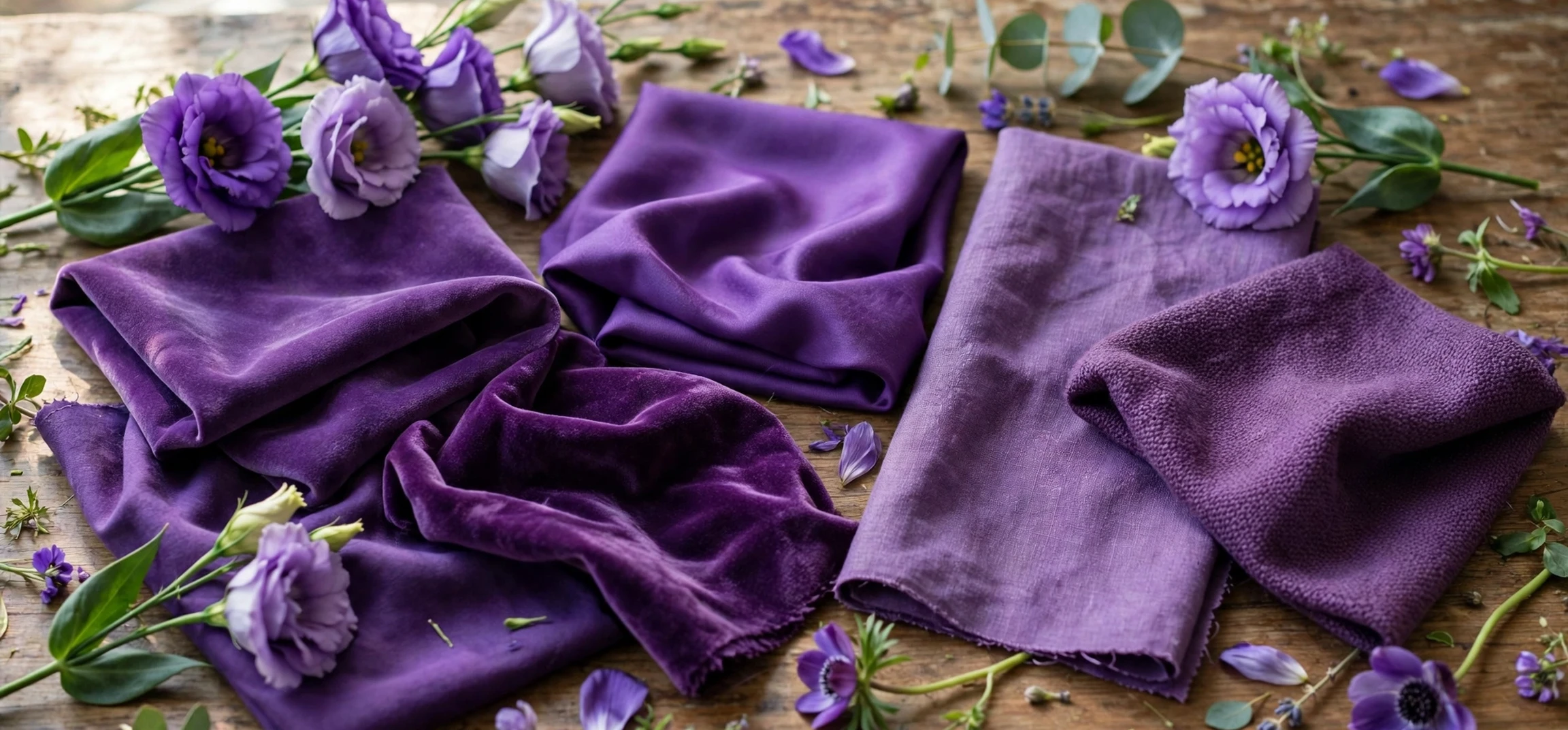
Because purple spans a broad range, it helps to think in terms of shades rather than a single meaning. Lavender, a pale purple with a grey or blue leaning, is often associated with calm, cleanliness, and gentle romance, partly through its link with the lavender plant and its scent. Lilac, slightly pinker and brighter, is often associated with youth, spring, and first love in floral language. Violet, a deeper and bluer purple, is often associated with depth, spirituality, and formality. Plum, a dark reddish purple, is often associated with richness, maturity, and understated luxury. Magenta, at the pink edge of purple, is often associated with boldness, energy, and modernity.
These shade associations are tendencies, not definitions, and they overlap. A lilac dress at a wedding and a lilac logo for a technology company will be read differently, because context changes meaning. Lighting also changes how a shade appears: a purple that looks rich under warm indoor light may look cold or grey under fluorescent light, and a purple on a screen may look different again in print. Designers therefore test shades in the conditions where they will actually be seen, rather than trusting a name or a screen swatch alone. That practical point is often more useful than any list of symbolic meanings.
| Shade | Usual feel | Common uses |
|---|---|---|
| Lavender | Calm, gentle, clean | Wellness, bedding, spring fashion |
| Lilac | Soft, youthful, romantic | Florals, weddings, light branding |
| Violet | Deep, spiritual, formal | Art, ceremony, premium packaging |
| Plum | Rich, mature, luxurious | Autumn fashion, interiors, wine branding |
| Bright violet or magenta-leaning purple | Bold, playful, modern | Creative brands, entertainment, youth products |
Purple and Personal Preference
It is common to ask what a favourite colour says about a person, and purple lovers are often described in popular writing as creative, intuitive, individualistic, or spiritually inclined. Those descriptions are entertaining, but they are not reliable personality tests. Favourite colour is influenced by fashion, by available products, by peer groups, and by simple habit, and it changes over a lifetime. A person who loves purple at one stage of life may prefer green or navy at another, without any deep change in character. Treating a colour preference as a diagnosis is therefore a mistake, even though it makes for appealing magazine copy.
What a colour preference can reveal, more modestly, is something about taste and context at a given moment. Choosing purple clothing, for example, may signal a willingness to stand out, because purple is less common than black, navy, or grey in everyday wardrobes. Choosing purple for a home interior may signal a taste for richness or drama, especially in a deep shade, or for calm, especially in a pale shade. Those signals are social, not psychological in a clinical sense: they are about how a person wants to be seen, and how others are likely to read the choice, rather than about hidden traits.
It is also worth noting that purple preference varies by age and culture in ways that surveys capture only roughly. Children often favour bright purples, while adults may favour deeper or paler shades. Gendered marketing has historically pushed purple towards certain audiences and away from others, which complicates any claim about who “naturally” likes purple. The safest conclusion is that purple appeals to a broad range of people for different reasons, and that its popularity rises and falls with fashion, just like any other colour.
Purple in Branding and Design
Designers choose purple when they want a brand or a room to feel distinctive. Because purple is less common than blue in corporate branding, it can help a company stand out, and because it carries associations with creativity and quality, it can suit businesses in arts, entertainment, beauty, and premium services. The risk is that purple can also feel unserious or overly decorative if the shade and context are wrong, so designers usually pair it carefully with neutrals such as white, grey, or black, or with a complementary accent, to keep the overall impression balanced.
In interiors, purple works best as an accent or a feature rather than as an overwhelming main colour, unless the aim is deliberately dramatic. A plum feature wall, lavender bedding, or violet cushions can add richness without dominating a room. In fashion, purple ranges from a subtle lilac scarf to a bold violet coat, and its effect depends on the shade, the fabric, and what it is worn with. In all these cases, the principle is the same: purple is a strong colour, and a little of it often goes further than a great deal.
For readers choosing purple for a project, the practical steps are simple. First, decide what impression you want: calm, luxurious, creative, or bold. Second, choose a shade that matches that impression, testing it in real light and alongside the other colours in the scheme. Third, consider the audience and the cultural context, since purple carries different meanings in different settings. Finally, remember that colour is only one part of design. Typography, layout, material, and wording matter just as much, and a well-chosen purple will support those elements rather than carrying the whole design on its own. For related reading, see our guide on the names of different blue shades and our explainer on what flag colours can symbolise.
Frequently Asked Questions (FAQ)
What does purple symbolise most commonly?
Most commonly, purple symbolises royalty, luxury, creativity, spirituality, and mystery. Those associations come largely from the historical rarity and cost of purple dye and from its long use in ceremonial and religious dress.
Does purple have a proven psychological effect?
Colour can influence mood and impression, but effects are modest and context-dependent. Purple is often linked with creativity and calm in popular colour psychology, but those claims should not be treated as fixed scientific rules.
Why do different shades of purple feel different?
Because purple spans blue-leaning, red-leaning, pale, and dark shades. Pale purples tend to feel soft and calm, dark purples tend to feel rich and formal, and bright purples tend to feel bold and playful.
Is purple a good colour for branding?
It can be, especially for creative, premium, or distinctive brands, because it stands out from more common corporate blues. Success depends on shade, context, and pairing with neutrals, and on testing with the intended audience.
Conclusion
The meaning of the colour purple, in the end, is a story of rarity becoming symbolism. A dye that was once costly and restricted became a sign of royalty and luxury, and from there purple gathered associations with creativity, spirituality, mystery, and imagination. Colour psychology adds nuance, showing that shade, light, and personal experience shape how purple is felt, but it does not reduce purple to a single effect. Whether you meet purple in a painting, a brand, a garden, or a wardrobe, its power lies in that blend of history and feeling: a colour that is familiar, yet still a little out of the ordinary.