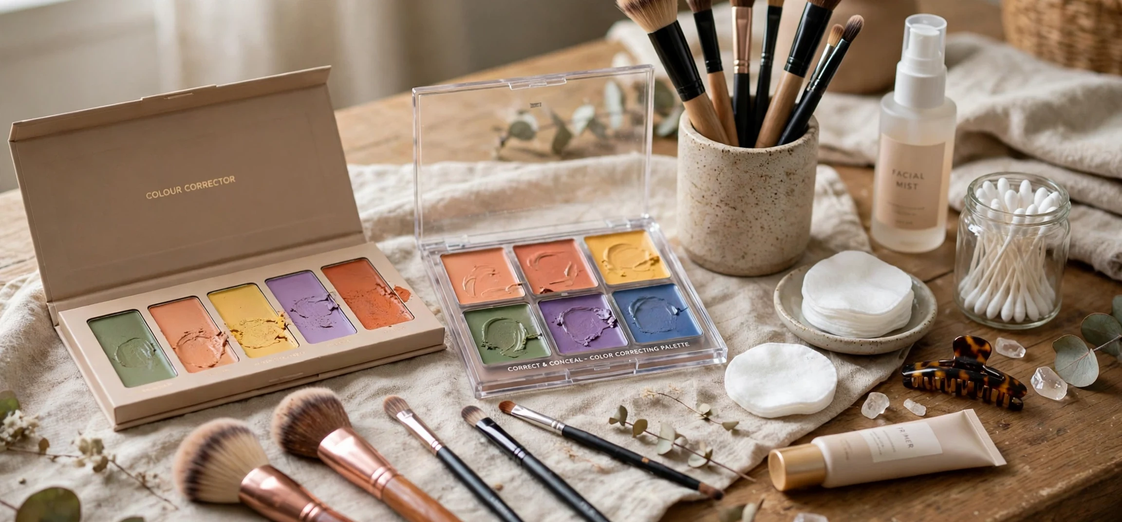
A good colour correctors guide starts with a simple idea from colour theory: colours opposite each other on the colour wheel cancel each other out. Green neutralises redness, peach counteracts dark circles, yellow brightens dullness, and purple lifts sallowness. Colour correctors are makeup products designed around this principle, applied before foundation to neutralise discolouration so that less foundation is needed for an even finish. This colour correctors guide explains each corrector colour, how to choose the right one for your skin tone and concern, and how to apply correctors without ending up with visible patches of colour on your face.
How Colour Correctors Work
Colour correction relies on complementary colours. When two opposite colours are layered, they neutralise each other and produce a neutral tone. This is why a green-tinted product can make redness disappear: green and red are opposites, and blending them yields a neutral shade close to skin tone. The corrector does not remove the discolouration; it optically cancels it, so that the foundation applied over the top has far less work to do.
This principle matters because it explains why correctors must be used sparingly. A thin layer neutralises; a thick layer creates a new discolouration in the corrector’s own colour. The goal is always the smallest amount that does the job, blended thoroughly, with foundation layered over it to unify everything. Used this way, correctors produce a more natural finish than heavy foundation alone, because the skin’s texture remains visible while the colour is evened out.
Colour Corrector Shades and What They Fix
Green correctors target redness: blemishes, rosacea, broken capillaries, and general flushing. They are the most widely used corrector colour and the most forgiving for beginners, because redness is common and green neutralises it effectively. Peach and orange correctors target dark circles and hyperpigmentation. Peach suits lighter skin tones, while deeper orange suits medium to deep skin tones, because the corrector must be deep enough to counteract the darkness without looking ashy.
Yellow correctors brighten dull, sallow areas and can soften mild purple tones. Lavender or purple correctors counteract sallowness and yellow undertones, adding brightness to tired-looking skin. Pink correctors add warmth and radiance to fair skin and can brighten dull areas. Blue correctors are less common but can neutralise orange tones, such as overly warm self-tan or hyperpigmentation with an orange cast.
| Corrector colour | Neutralises | Best for |
|---|---|---|
| Green | Redness | Blemishes, rosacea, flushing |
| Peach | Dark circles, spots | Light to medium skin |
| Orange | Dark circles, hyperpigmentation | Medium to deep skin |
| Yellow | Purple tones, dullness | Under-eye area, bruising |
| Lavender | Sallowness, yellow tones | Dull, tired skin |
| Pink | Dullness | Fair skin brightening |
Choosing Correctors for Your Skin Tone
Skin tone determines which corrector shades work and how deep they should be. Fair skin suits lighter, pastel correctors: pale green for redness, light peach for dark circles, soft lavender for sallowness. Medium skin can use standard-strength correctors, with peach rather than orange for under-eye darkness. Deep skin needs richer correctors: deep orange or red-orange for dark circles and hyperpigmentation, because lighter correctors can look grey or ashy on deep skin.
Undertone matters too. If your skin has warm undertones, yellow-based correctors blend more naturally; if it has cool undertones, pink-based correctors suit better. When in doubt, test a corrector on your jawline in natural light and check whether it disappears into the skin after blending. A corrector that remains visible as a coloured patch is either the wrong shade or applied too heavily.
How to Apply Colour Correctors
Application order matters: corrector goes on after skincare and primer but before foundation. Start with a small amount — less than you think you need — and place it precisely where the discolouration is, rather than spreading it across a wide area. A small brush or your fingertip works well for precise placement; a damp sponge is better for blending the edges so the corrector fades into the surrounding skin.
Blend the edges, not the centre. The goal is a patch of neutralised colour with soft, invisible borders, not a fully blended layer that disappears entirely. Once the corrector is in place, apply foundation gently over the top, using a patting or stippling motion rather than sweeping strokes, which can drag the corrector away from where it is needed. Set with a light dusting of powder if desired, and check the result in natural light before leaving the house.
Common Colour Corrector Mistakes
The most common mistake is using too much product. Thick corrector layers look obvious, crease under the eyes, and can change the colour of the foundation applied over them. The second mistake is choosing the wrong colour for the concern: green on dark circles, for example, does nothing useful and can look strange. Match the corrector to the discolouration, not to whatever product you happen to own.
A third mistake is applying corrector over the entire face rather than targeting specific areas. Colour correction is a spot treatment, not a base layer. A fourth mistake is skipping foundation: corrector alone is not designed to look like skin, and it needs foundation over it to unify the finish. Finally, failing to blend edges leaves visible patches, which defeats the purpose entirely.
Corrector Formats: Creams, Liquids, and Palettes
Correctors come in several formats. Creams and sticks offer the most coverage and suit targeted work on blemishes and strong discolouration. Liquids are lighter and blend easily, making them good for the under-eye area and for beginners. Palettes contain multiple colours in one compact, which is economical if you have several concerns, but the individual pans are small and the shades may not suit your skin tone. Single-colour products let you buy exactly the shade you need and are usually the better choice for a first corrector.
Texture also affects performance. Dry skin generally suits creamy, hydrating correctors that do not settle into fine lines, while oily skin suits lighter, longer-wearing formulas that resist sliding. Setting corrector with a small amount of powder improves wear time for all skin types, particularly under the eyes, where creasing is a common complaint.
Colour Correctors Guide: Building a Daily Routine
Building colour correction into a daily routine is simpler than it first appears. Start with skincare: cleanse, moisturise, and apply sunscreen as usual, then add a primer if you use one. Next, assess your face in natural light and identify the areas that actually need correction — often just the under-eye area and one or two blemishes. Apply the appropriate corrector to those spots only, blend the edges, and follow with foundation. The whole correction step should take under a minute once you know your shades and your trouble spots.
For days when you want minimal makeup, corrector plus a light tinted moisturiser can replace full foundation. This lighter routine suits warm weather, casual settings, and days when comfort matters more than full coverage. The corrector does the targeted work, the tinted product unifies the finish, and the result looks like skin rather than makeup. Keep your corrector shades consistent across routines so that switching between full and light coverage never requires relearning your products.
Colour Correctors Guide: Shopping Tips
Shopping for correctors is easier with a plan. Identify your main concern first — redness, dark circles, or dullness — and buy one corrector for that concern before expanding your collection. Test shades on your jawline in natural light, not under shop lighting, which distorts colour. Ask for samples where available, and wear a test shade for a full day before committing, since a corrector that looks right in the shop may behave differently after hours of wear.
Price is a poor guide to corrector quality. Many affordable correctors perform as well as luxury ones, because the active principle is simply pigment in a blendable base. What matters more is texture match to your skin type, shade accuracy, and staying power. Read ingredient lists if you have sensitive skin, favouring fragrance-free formulas, and replace correctors that have changed smell or texture, since old makeup can irritate skin and harbour bacteria.
Frequently Asked Questions
What does a colour correctors guide recommend for redness?
Green corrector. Green is opposite red on the colour wheel, so it neutralises redness from blemishes, rosacea, and flushing.
Which corrector colour hides dark circles?
Peach for light to medium skin and deeper orange for medium to deep skin. Both counteract the blue and purple tones of dark circles.
Do I apply corrector before or after foundation?
Before. Corrector neutralises discolouration first, then foundation unifies the overall finish.
Can I use corrector without foundation?
It is not recommended. Corrector is not designed to look like skin on its own and needs foundation over it for a natural finish.
How much corrector should I use?
As little as possible. A thin layer neutralises; a thick layer creates a new visible colour patch.
Conclusion
This colour correctors guide comes down to a few principles: match the corrector colour to the discolouration using the colour wheel, choose a depth suited to your skin tone, apply sparingly and precisely, blend the edges, and finish with foundation. Green for redness, peach or orange for dark circles, yellow for dullness, and lavender for sallowness cover nearly every concern, and the right format — cream, liquid, or palette — depends on your skin type and the area you are correcting. Used thoughtfully, colour correctors let you use less foundation while achieving a more even, natural-looking finish, which is exactly what good makeup should do. For more beauty guidance, see our article on beauty product names explained and our guide to everyday self-care routines.