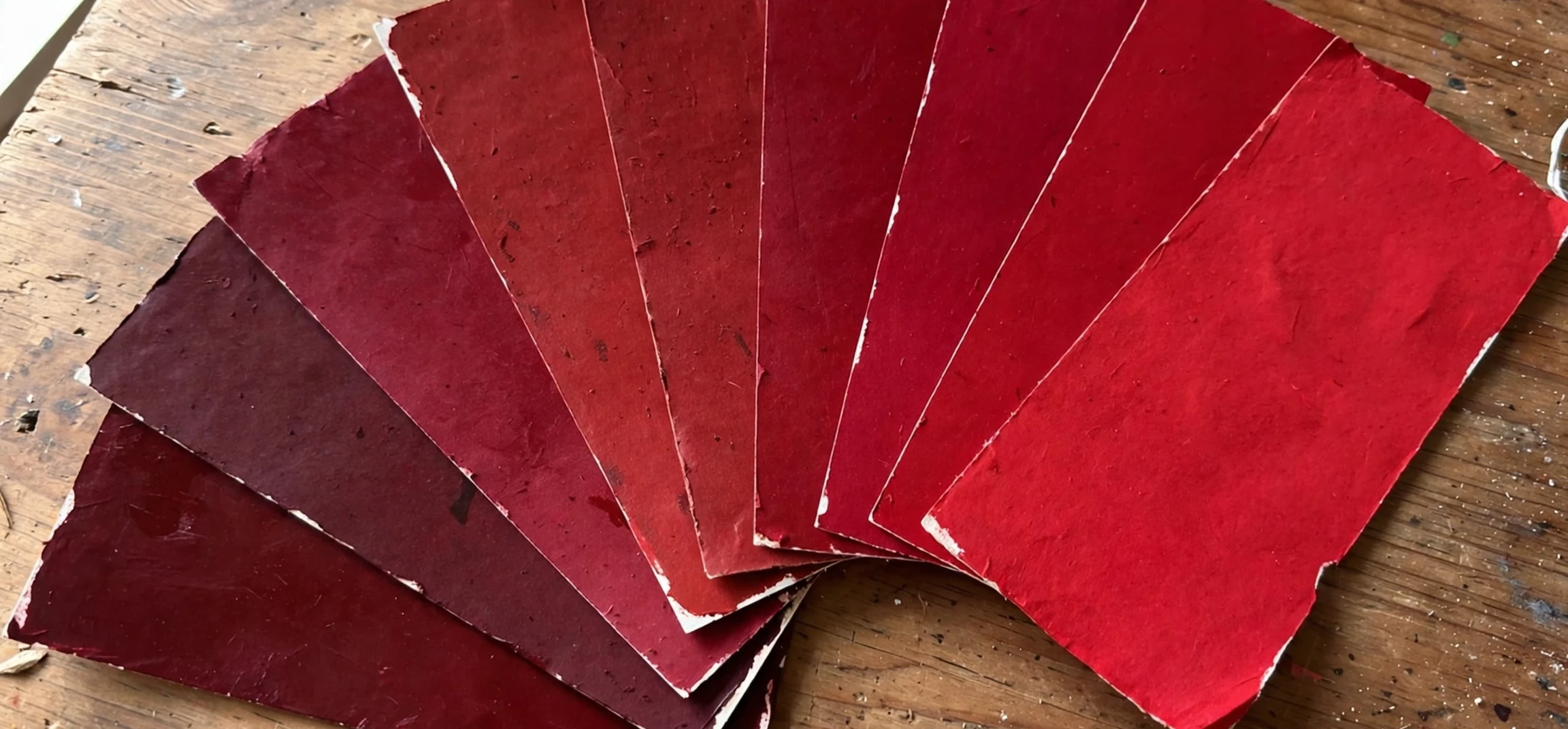
Learning the different colors of red names is the fastest way to stop saying just red when you mean something far more specific. Crimson is not scarlet, scarlet is not burgundy, and burgundy is not cherry, yet all of them sit under the broad umbrella of red. Designers, painters, writers and shoppers all run into the same problem: the word red covers a huge family of shades, from pale pinkish tints to deep wine tones that are almost purple. This guide to the different colors of red names will help you tell them apart, with a table of shades, plain-language descriptions, and practical tips for choosing the right red for paint, fabric, branding or writing. By the end, you will be able to name the red you are looking at instead of settling for an approximation.
Different Colors of Red Names: An Overview
Red is one of the most emotionally powerful colours in the spectrum, associated with energy, passion, warmth, danger and celebration. That power is also why it has so many named shades: people needed finer words to describe the difference between a warning sign and a rose petal, between a lipstick and a brick wall. That range is exactly why the different colors of red names deserve a proper guide. The different colors of red names fall roughly into groups based on what they lean towards. Some lean orange, such as scarlet and vermilion, and feel hot and vivid. Some lean pink, such as rose and coral, and feel softer and more romantic. Some lean purple, such as burgundy and maroon, and feel darker, richer and more formal. Some lean brown, such as rust and brick, and feel earthy and grounded. Knowing which direction a red leans is the quickest way to narrow it down.
It also helps to understand three simple ideas that colour professionals use: hue, value and saturation. Hue is the basic colour family, which here is always red. Value is how light or dark the shade is, so a pale red and a deep red can share a hue but look entirely different. Saturation is how intense or muted the shade is, so a vivid cherry and a dusty brick red differ mainly in saturation. When you describe a red, try to note all three: is it light or dark, bright or muted, and does it lean orange, pink, purple or brown? Those answers will point you to the right entry among the different colors of red names. Answering those questions will usually lead you straight to the right name.
Different Colors of Red Names: The Complete Table
The table below gathers the most useful and widely recognised red shades, with a description of each and a hex-style reference that designers can use as a starting point. Hex codes are six-character codes used in web design to specify an exact colour, and the values given here are the commonly accepted reference points for each shade name. Remember that screens, printers and fabrics all render colour slightly differently, so treat these as guides rather than absolute matches. Even so, learning the different colors of red names starts with recognising these reference points.
| Shade name | Description | Hex reference |
|---|---|---|
| Crimson | A strong, slightly purplish red, rich and vivid, long associated with royalty and ceremony. | DC143C |
| Scarlet | A bright red leaning towards orange, bold and fiery, famous in uniforms and academic dress. | FF2400 |
| Cherry | A lively mid-red, like the skin of a ripe cherry, fresh and cheerful. | DE3163 |
| Burgundy | A deep, dark red leaning towards purple, named after Burgundy wine, elegant and formal. | 800020 |
| Maroon | A dark brownish red, quieter than burgundy, common in school colours and interiors. | 800000 |
| Ruby | A deep pinkish red, like the gemstone, jewel-like and luxurious. | E0115F |
| Rose | A soft pinkish red, romantic and gentle, midway between red and pink. | FF007F |
| Coral | A warm reddish pink leaning orange, like coral reefs, summery and bright. | FF7F50 |
| Vermilion | A brilliant orange-red, historically made from a vivid pigment, intense and striking. | E34234 |
| Rust | An earthy brownish red, like oxidised iron, warm and rustic. | B7410E |
| Brick | A muted brownish red, like fired clay bricks, dependable and warm. | CB4154 |
| Wine | A very dark purplish red, like red wine in shadow, sophisticated and deep. | 722F37 |
| Carmine | A vivid purplish red, historically from a natural dye, intense and slightly cool. | 960018 |
| Salmon | A pale pinkish orange-red, like salmon flesh, soft and warm. | FA8072 |
| Magenta | A purplish red that sits between red and purple, electric and modern. | FF00FF |
Studying this table is the best way to build your vocabulary. Notice how crimson and carmine sit close together, both leaning purple, while scarlet and vermilion lean orange. Notice too how burgundy, maroon and wine form a dark family, differing mainly in how much purple or brown they contain. If you are choosing paint, ask for a swatch rather than trusting a screen, because the same shade can look different under warm indoor light and cool daylight. If you are writing, choose the shade that matches the mood: scarlet for drama, rose for tenderness, burgundy for formality, rust for earthiness.
Warm Reds That Lean Orange
Orange-leaning reds are the hottest members of the family, and they suit settings where energy and attention matter. Scarlet is the classic example: it is the red of guards’ uniforms, of warning flags, and of dramatic evening wear. It advances towards the eye, which is why it works so well for calls to action, sale signs and sports kits. Vermilion is even more orange and more intense, with a history in art and printing that goes back centuries. Tomato red, a brighter and slightly lighter cousin, feels friendly and informal, which is why it appears so often in casual clothing and food packaging. These shades pair well with warm neutrals such as cream, camel and gold, and they clash with cool purples, so keep the palette warm when you use them.
When decorating with orange-leaning reds, a little goes a long way. A scarlet accent wall can energise a room, but four scarlet walls can feel overwhelming, especially in a small space. Designers often recommend using the bold red for one feature, such as a door, a sofa or a piece of art, and balancing it with soft whites, warm greys or natural wood. In clothing, an orange-leaning red suits most skin tones when worn away from the face, for example as a skirt, a bag or shoes, while a scarf in the same shade can be trickier. Testing shades this way builds real fluency in the different colors of red names. Try the shade against your skin in natural light before committing, since artificial shop lighting can flatter a red that looks harsh outdoors.
Scarlet Versus Vermilion: How to Tell Them Apart
Scarlet and vermilion confuse many people, because both are vivid orange-reds. The difference is subtle but real: vermilion is slightly more orange and slightly lighter, while scarlet is slightly deeper and closer to true red. If you place swatches side by side, vermilion will look warmer and more flame-like, whereas scarlet will look a touch more solid and formal. Historically, vermilion was a pigment name, while scarlet was a cloth and dye name, which is why the two words come from different trades. Trade history explains several of the different colors of red names. In everyday use, either word will be understood, but choosing precisely will impress anyone who works with colour.
Cool Reds That Lean Purple
Purple-leaning reds feel cooler, darker and more formal than their orange cousins, and they are the shades most often chosen for luxury, ceremony and evening wear. Crimson is the best known: it is vivid yet slightly cool, and it has centuries of association with academic robes, religious vestments and royal ceremony. Burgundy is darker and quieter, the colour of fine wine, and it is a favourite for leather goods, formal dresses and sophisticated branding. Carmine sits between the two, brighter than burgundy but cooler than scarlet, and it appears in cosmetics and art supplies. Wine is the darkest of the group, almost brown-purple in low light, and it suits autumn interiors and evening palettes beautifully.
These cool reds pair well with silver, charcoal, navy and soft grey, and they are often easier to wear than bright reds because they sit more quietly against the skin. That wearability is one reason the different colors of red names include so many cool, dark options. A burgundy dress or a crimson tie can look striking without shouting, which is why these shades dominate formal occasions. In interiors, cool reds work well in dining rooms and libraries, where their depth creates a sense of warmth and enclosure. If you are interested in how colour names work more broadly, our guide to the meaning of analogous colours explains how neighbouring colours on the colour wheel relate to each other. You may also enjoy the names of different blue colours, which applies the same shade-by-shade approach to the blue family. Comparing families is a good way to master the different colors of red names.
Soft, Pale and Earthy Reds
Not every red needs to be bold. The softer members of the family, such as rose, coral and salmon, bring warmth without intensity, and they are popular in spring fashion, weddings and nurseries. Rose is the most versatile of the three: it reads as red in a bouquet and as pink in a fabric swatch, which makes it a useful bridge between the two families. Bridge shades like rose show how flexible the different colors of red names can be. Coral adds an orange warmth that flatters many skin tones and feels summery, while salmon is paler and more muted, suited to relaxed, coastal palettes. These shades work beautifully with white, sage green and soft gold, and they are forgiving choices when you want colour without drama.
Earthy reds sit at the opposite end of the mood scale: rust, brick and terracotta feel grounded, natural and timeless. Rust is the colour of autumn leaves and oxidised metal, and it pairs superbly with denim, olive and cream. Brick is slightly more muted and more brown, the colour of old buildings and garden walls, and it brings a sense of permanence to interiors. Terracotta, a close relative, leans further towards orange-brown and is a staple of Mediterranean style. If you are choosing a red for a home exterior or a rustic interior, these earthy shades are usually safer than bright reds, because they harmonise with natural materials such as wood, stone and clay. Earthy choices like these round out the different colors of red names. For a different kind of colour guide, see the American Spirit colour guide, which shows how colour naming works in a branding context.
Frequently Asked Questions About Red Shades
What is the difference between crimson and burgundy? Crimson is brighter and more vivid, leaning slightly purple, while burgundy is darker and quieter, like red wine. This contrast is a classic test of the different colors of red names. Crimson suits ceremony and drama; burgundy suits formality and luxury.
What is the darkest shade of red? Wine and oxblood are among the darkest reds, sitting so deep that they can look almost black-brown in low light. Maroon and burgundy are also very dark, but slightly lighter than wine.
Which red shade suits pale skin? Cool reds such as crimson, ruby and burgundy usually flatter pale skin, because they do not clash with pink undertones the way orange-leaning reds sometimes can. Always test in natural light.
Is magenta a shade of red? Magenta sits on the boundary between red and purple. Many colour systems class it as a purplish red, while others treat it as its own hue. Either way, it belongs in any complete discussion of red names.
Conclusion
The different colors of red names give you a vocabulary for one of the richest colour families in existence, from fiery scarlet and vermilion through jewel-like ruby and crimson to deep burgundy, wine and earthy rust. Each of these different colors of red names carries its own mood and history. Learning to distinguish these shades is not just a matter of showing off: it helps you choose paint with confidence, buy clothing that flatters you, write descriptions that readers can picture, and design palettes that feel intentional rather than accidental. Keep the table in this guide bookmarked, test shades in natural light before committing, and pay attention to whether a red leans orange, pink, purple or brown. Once you can name the red you are looking at, you will never be satisfied with just saying red again. Once you know the different colors of red names, plain red feels incomplete.