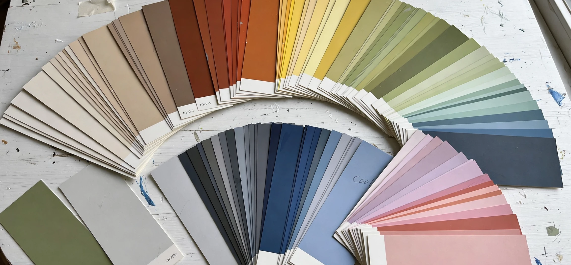
Learning colors types and names is one of the most satisfying parts of design, art, fashion, and everyday language, because colour is everywhere and yet most people only use a handful of words for it. When you explore colors types and names properly, you discover that red is not just red: it can be crimson, scarlet, burgundy, coral, or vermilion, and each of those words carries a different mood, a different temperature, and a different use. This guide walks through the main colour families, explains how colours are grouped, and gives you a practical vocabulary you can use for painting, decorating, dressing, designing, and describing the world more precisely.
Colour vocabulary matters more than it first appears. A designer who asks for blue may receive anything from sky blue to navy, and a shopper who orders a green dress may be surprised by the shade that arrives. The words we use for colours types and names act as a shared shorthand between the person imagining a colour and the person mixing, printing, dyeing, or buying it. The more precise your vocabulary, the fewer surprises you get, and the more confidently you can combine colours that genuinely work together.
Colors Types and Names: The Basics
Every discussion of colors types and names starts with the colour wheel, a circle that arranges hues in the order they appear in a spectrum. The three primary colours in traditional art theory are red, yellow, and blue. Mix two primaries and you get secondary colours: orange from red and yellow, green from yellow and blue, and purple from blue and red. Mix a primary with a neighbouring secondary and you get tertiary colours such as yellow-orange, red-orange, red-purple, blue-purple, blue-green, and yellow-green. These twelve hues form the backbone of most colour systems.
Beyond hue, colours vary in three important ways. Value describes how light or dark a colour is: add white and you get a tint, add black and you get a shade, add grey and you get a tone. Saturation describes how vivid or muted a colour is: a saturated colour is intense and pure, while a desaturated colour looks soft, dusty, or greyed. Temperature describes whether a colour feels warm, like reds, oranges, and yellows, or cool, like blues, greens, and purples. When you learn colors types and names, you are really learning to notice all four dimensions at once: hue, value, saturation, and temperature.
Colour also has a cultural dimension. Names such as millennial pink, Gen Z yellow, or Tiffany blue show how a single shade can pick up associations from fashion, branding, or a particular era. Those associations change over time, which is why colour naming is partly science and partly fashion. The families in this guide are stable, but individual trendy names come and go, so it pays to learn the family first and the fashion name second.
Colors Types and Names in the Red Family
Red is the most attention-grabbing colour family, associated with energy, passion, urgency, and warmth. Within it, scarlet is a bright, slightly orange red that feels bold and lively. Crimson is a deeper, slightly bluish red with a rich, almost velvety quality. Burgundy, named after a famous wine region, is a dark, brownish red that feels formal and luxurious. Coral sits between red and orange with a soft pink warmth, while vermilion is a brilliant orange-red long prized by painters. Ruby describes a deep, jewel-like red, and maroon is a dark, brownish red often used in uniforms and academic dress.
Reds are used carefully in design because they demand attention. A small amount of red can energise a room or a poster, while a large amount can feel overwhelming. In branding, red signals excitement and appetite, which is why it appears so often in food and entertainment. In nature, red warns and attracts at once, from berries to sunsets, and that double signal is part of why the red family holds so many distinct names: we need different words for a warning red, a romantic red, and a formal red.
Colors Types and Names in the Blue and Green Families
Blue is the most popular favourite colour in survey after survey, and its family is enormous. Sky blue is pale and airy, like a clear morning. Baby blue is a soft, gentle tint often used for nurseries and spring clothing. Royal blue is a rich, saturated medium blue with a formal edge. Navy is a very dark blue that works almost like a neutral in clothing and interiors. Turquoise sits between blue and green, recalling tropical water. Teal is a darker blue-green with a sophisticated, modern feel. Indigo is a deep blue-purple, historically made from plant dye, and cobalt is a vivid, slightly purplish blue beloved by ceramicists.
Green, the colour of leaves and growth, ranges from the yellow-green of lime and chartreuse through the fresh mid-green of emerald to the deep, muted tones of forest green, olive, and sage. Mint is a pale, cool green with a fresh, clean feeling. Jade is a medium green named after the stone, with a slightly blue cast. Olive is a yellowish dark green with a natural, earthy quality, while sage is a greyish green that has become a favourite neutral in home decor. Understanding colors types and names in these two families is especially useful for interiors, because blues and greens dominate calm, natural, and professional spaces.
Colors Types and Names in the Warm Families
Orange, yellow, pink, and brown form the warm side of the spectrum, and each family has its own character. Orange ranges from peach, a soft pinkish orange, through tangerine and amber to burnt orange, a deep, autumnal tone. Yellow ranges from lemon, a bright cool yellow, through golden yellow and mustard to ochre, an earthy yellow-brown used since prehistoric painting. Pink ranges from blush, a barely-there pale pink, through rose, salmon, and hot pink to magenta, a vivid purplish pink that sits on the boundary with purple. Brown ranges from tan and beige through caramel, chocolate, and chestnut to mahogany, a rich reddish brown.
Warm colours advance visually: they seem to come towards the viewer, which is why they are used for focal points, invitations, and cosy rooms. A warm accent wall can make a large room feel intimate, and warm clothing colours flatter many skin tones. But warmth needs balance. Pairing a warm family with a cool neutral, such as cream, grey, or navy, keeps the result lively rather than loud. Noticing these behaviours is a core skill when learning colors types and names for real rooms and outfits. When you study colors types and names, notice how warm and cool families behave differently in the same space: that contrast is one of the designer’s most reliable tools.
Colors Types and Names: Purples and Neutrals
Purple has long carried associations with royalty, creativity, and mystery, partly because purple dye was once rare and expensive. Lavender is a pale, greyish purple with a calm, floral quality. Lilac is a slightly pinker pale purple. Violet is a strong, bluish purple, while plum is a dark, reddish purple like the fruit. Mauve is a muted, greyish purple that works beautifully as a soft neutral. Orchid is a brighter, pinkish purple named after the flower.
Neutrals deserve a family of their own, because they do the quiet work in almost every palette. White includes pure white, ivory, cream, and snow, each with a different warmth. Grey ranges from silver and ash through slate to charcoal, a near-black grey. Black includes jet black, soft black, and off-black, which is black with a hint of another colour. Beige, taupe, and greige, a blend of grey and beige, bridge the gap between warm and cool neutrals. Neutrals let brighter colors types and names shine without competing, which is why they dominate walls, workwear, and web design backgrounds.
Colors Types and Names Reference Table
The table below summarises the main families with three representative names each, so you can compare families at a glance.
| Family | Light Name | Mid Name | Dark Name |
|---|---|---|---|
| Red | Coral | Scarlet | Burgundy |
| Orange | Peach | Tangerine | Burnt orange |
| Yellow | Lemon | Golden yellow | Mustard |
| Green | Mint | Emerald | Forest green |
| Blue | Sky blue | Royal blue | Navy |
| Purple | Lavender | Violet | Plum |
| Pink | Blush | Rose | Magenta |
| Brown | Tan | Caramel | Chocolate |
| Neutral | Ivory | Grey | Charcoal |
Use this table as a starting point, not a finish line. Paint brands, fabric mills, and digital tools each add their own names, and two products called sage or teal may differ slightly. When exact matching matters, compare a physical swatch or a colour code rather than trusting a name alone. Names guide you to the right family; codes confirm the exact shade.
How to Choose and Combine Colors Types and Names
Choosing colours becomes much easier with a simple method. Start with one dominant colour that sets the mood, add one supporting colour that harmonises with it, and finish with one accent colour for contrast. Analogous schemes use neighbours on the wheel, such as blue, teal, and green, and feel calm and unified. Complementary schemes use opposites, such as blue and orange, and feel energetic and bold. A working grasp of colors types and names makes each of these schemes easier to describe and repeat. Monochromatic schemes use one hue in different tints and shades, and feel elegant and safe.
Test combinations in the real context where they will live. A colour that looks perfect on a phone screen may look different on a painted wall under warm evening light, and a fabric colour may shift beside other garments. Collect swatches, view them in daylight and artificial light, and live with a shortlist for a day before committing. That habit turns colors types and names from a list to memorise into a tool you actually use. Good colour choices are rarely rushed, and a vocabulary of colors types and names helps you describe what you liked or disliked about each candidate precisely enough to improve the next round.
Frequently Asked Questions About Colors Types and Names
How many colours are there?
There is no single answer, because colour is continuous: the eye can distinguish millions of shades. Named colours number in the thousands across paint, textile, and digital systems, but most everyday use relies on a few dozen well-known family names.
What is the difference between a tint, a shade, and a tone?
A tint adds white to a colour, making it lighter. A shade adds black, making it darker. A tone adds grey, making it softer and more muted without strongly changing its lightness.
Are warm and cool colours fixed categories?
Broadly, reds, oranges, and yellows are warm, while blues, greens, and purples are cool, but individual shades can lean either way. A yellow-green may feel warm, while a blue-green may feel cool, depending on its neighbours.
Why do the same colours have different names?
Different industries, brands, and cultures name colours independently, and marketing adds poetic names. Family names such as navy, teal, and burgundy are widely shared, while brand names vary, so compare swatches when precision matters.
Conclusion
A rich vocabulary of colors types and names turns vague colour talk into clear communication, whether you are painting a room, designing a logo, choosing an outfit, or simply describing a sunset. Learn the wheel, learn the families, and learn the difference between tints, shades, and tones, and you will find it far easier to pick combinations that feel intentional rather than accidental. For more colour inspiration, see our colour guide companion and our review of true colour on screen. Start with one family you love, name its shades precisely, and build outward from there.