If you are looking for the definition of contrast in art, the clearest starting point is this: contrast is the deliberate difference between elements in a work of art, used to create emphasis, interest, depth and visual energy. When an artist places light beside dark, warm colour beside cool colour, large shape beside small shape, or rough texture beside smooth texture, the eye notices the difference and is drawn to it. That difference is contrast, and it is one of the most powerful tools in composition. This guide explains the definition of contrast in art in depth, with types, examples, techniques and common mistakes, so that students, hobby painters, photographers and design lovers can recognise contrast and use it with intention.
Contrast works because human vision is built to notice change. A flat, uniform surface is easy to ignore, but a sudden shift in brightness, colour or size commands attention. Artists have known this for centuries, even before the language of art theory formalised it. In a portrait, the brightest highlight on a face stands out against a darker background. In a landscape, a small figure against a vast sky creates a sense of scale. In a poster, bold black type on white paper is readable precisely because the difference is strong. In each case, contrast does the same job: it organises what the viewer sees first, second and last, and it gives the work a sense of structure. That organising role is the heart of the definition of contrast in art.
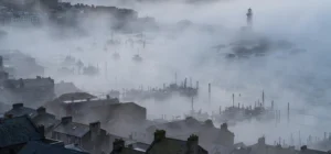
It helps to think of contrast as a spectrum rather than a single trick. At one end is low contrast, where elements are similar in value, colour or texture, producing a soft, calm, unified feeling. At the other end is high contrast, where differences are extreme, producing drama, tension and immediate impact. Neither end is better in itself. A misty watercolour may rely on low contrast to feel peaceful, while a graphic poster may rely on high contrast to shout its message. The skill lies in choosing the right level of contrast for the mood, subject and purpose of the work, and in controlling where the strongest contrast falls. Choosing levels deliberately is what the definition of contrast in art asks of every maker.
Definition of contrast in art and value
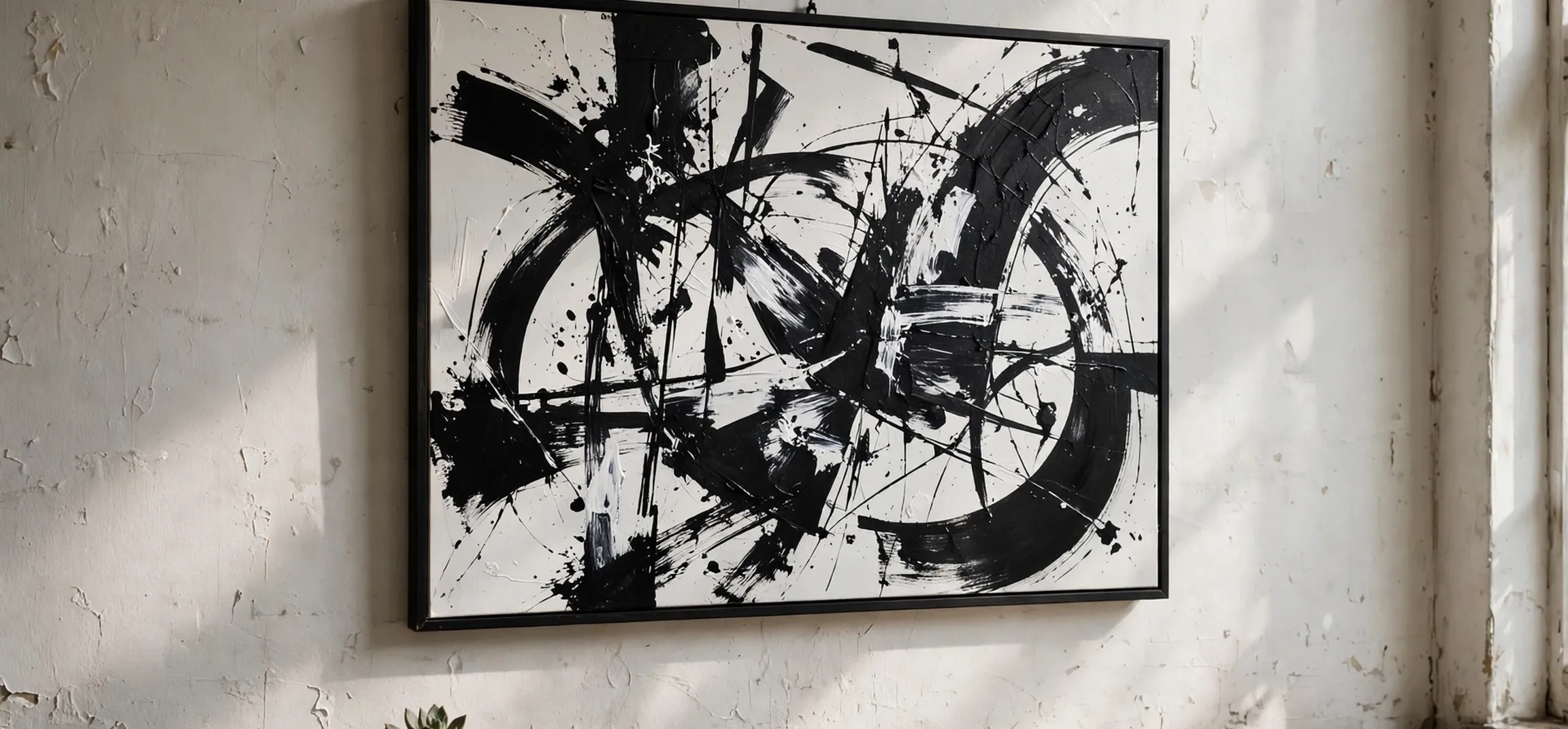
The most fundamental form in the definition of contrast in art is value contrast, meaning the difference between light and dark. Value is how light or dark a colour appears, regardless of its hue, and value contrast is what makes a drawing readable even in black and white. Artists use a value scale from pure white to pure black, with many greys in between, and they place the lightest and darkest values near the focal point to pull the eye there. A classic example is chiaroscuro, the dramatic light-and-dark modelling used in Baroque painting, where a brightly lit figure emerges from deep shadow. The technique is powerful because it mimics how we see in real life, where light sculpts form.
Students can practise value contrast by squinting at a scene, which reduces colour information and reveals the underlying light-dark pattern. They can also make a thumbnail sketch in only three or four values, forcing themselves to decide what is truly light, mid-tone and dark. Photographers use the same principle when they expose for highlights or shadows, and graphic designers use it when they choose dark text on a light background for legibility. In all these cases, the rule is consistent: the strongest value contrast attracts the eye first, so it should be placed deliberately, not accidentally, at the point the artist wants viewers to notice. Testing in black and white is a classic check drawn from the definition of contrast in art.
Value contrast also creates depth. Objects in the foreground are often rendered with stronger value contrasts and sharper edges, while distant objects appear lighter, softer and lower in contrast, an effect known as atmospheric perspective. That difference helps the brain read a flat surface as three-dimensional space. When beginners complain that a painting looks flat, the cause is often insufficient value contrast in the foreground or too much contrast in the background, which flattens the sense of distance. Adjusting those relationships, rather than adding detail, is usually the quickest way to restore depth. Depth problems often trace back to the definition of contrast in art in value terms.
Definition of contrast in art and colour
Colour contrast is the second major form in the definition of contrast in art, and it includes several distinct relationships. Complementary contrast pairs colours opposite each other on the colour wheel, such as blue and orange or red and green, and each colour makes the other appear more vivid. Warm-cool contrast pairs warm colours such as red, orange and yellow with cool colours such as blue, green and violet, creating a sense of temperature and space, since warm colours tend to advance and cool colours tend to recede. Saturation contrast pairs a pure, intense colour with a muted, greyed version of a colour, so that the intense colour sings against its quieter neighbour.
Colour contrast needs careful handling, because two strong colours at full intensity can vibrate unpleasantly and tire the eye. Experienced painters therefore often contrast a small area of intense colour with a larger area of muted colour, or they lower the saturation of one complement so that the other can dominate. That restraint is what makes a red accent in a largely grey-green landscape feel exciting rather than garish. Designers follow the same logic in branding and posters: a single bold accent colour against a neutral palette is usually more effective than a rainbow of competing hues, because the eye needs a place to rest. Restraint is an underrated part of the definition of contrast in art.
Hue contrast, the difference between distinct colours themselves, is also important in textiles, illustration and stained glass, where clear colour separation defines shapes. In those media, contrast may come less from light and dark and more from the identity of the colours: a yellow shape beside a purple shape reads clearly even if their values are similar. Artists who work in colour should therefore test both value and hue separately, for example by photographing a work in black and white to check value contrast, and then returning to colour to check hue relationships. A work that relies only on hue may disappear in reproduction, while a work with strong value contrast survives in almost any medium. A work that relies only on hue may disappear in reproduction, which is why the definition of contrast in art also stresses value.
Other types of contrast in art
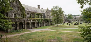
Beyond value and colour, artists use contrast of size and scale, placing a large form beside a small one to suggest importance, distance or surprise. A monumental sculpture beside a human figure, or a tiny boat on a vast sea in a painting, uses scale contrast to make the viewer feel the grandeur or loneliness of a scene. Shape contrast pairs geometric shapes, such as squares and circles, with organic shapes, such as leaves and clouds, so that each type looks more distinctive. A rigid building against soft trees, or a round face against angular clothing, gains character from that opposition. Scale is another chapter in the definition of contrast in art, because size alone can change how a scene feels.
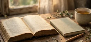
Texture contrast pairs rough with smooth, matte with glossy, or detailed with plain areas. In painting, thick impasto brushwork beside thin, flat washes creates a tactile difference that invites closer looking. In sculpture, polished marble beside rough stone makes the viewer want to touch the work and compare surfaces. In collage and mixed media, paper, fabric, metal and found objects bring their own textures, and the contrast between them becomes a central expressive device. Texture contrast is often subtle in photographs of art, but in person it is one of the most immediate ways a work engages the senses. Texture is often overlooked in the definition of contrast in art, yet it is immediate in person.
Other contrasts include edge contrast, where sharp edges sit beside soft, blended edges; contrast of direction, where horizontal lines meet vertical or diagonal lines; and contrast of detail, where a finely rendered focal area sits within a loosely painted background. All of these follow the same principle: difference creates attention, and controlled difference creates meaning. The artist’s task is not to maximise every contrast at once, which produces chaos, but to choose one or two dominant contrasts for the focal point and to keep supporting contrasts quieter, so that the composition has a clear hierarchy. Edge control completes the definition of contrast in art for many painters, since soft and sharp edges guide focus.
| Type of contrast | What differs | Typical effect |
|---|---|---|
| Value contrast | Light versus dark | Emphasis, form and depth |
| Colour contrast | Hue, temperature or saturation | Vividness and spatial push and pull |
| Scale contrast | Large versus small | Importance, grandeur or isolation |
| Shape contrast | Geometric versus organic | Character and visual variety |
| Texture contrast | Rough versus smooth | Tactile interest and richness |
| Edge contrast | Sharp versus soft edges | Focus and atmosphere |
For readers exploring colour relationships further, our guide to analogous colours explains the opposite strategy, where harmony comes from neighbouring colours rather than opposites, while our colour guide and our guide to different blue colours show how naming and grouping colours helps artists choose palettes with intention. Comparing harmony and contrast side by side is the fastest way to understand when to use each approach.
Using contrast well and avoiding common mistakes
The most common mistake with contrast is using maximum contrast everywhere. When every edge is sharp, every colour is saturated, and every value jumps from black to white, nothing stands out, because the eye has no hierarchy to follow. The result feels noisy rather than dramatic. A better approach is to decide on a single focal point, give that area the strongest contrast, and let the rest of the work support it with gentler differences. That hierarchy is what makes a composition feel professional, even when the subject matter is simple. Hierarchy is the practical payoff of the definition of contrast in art.
Another mistake is accidental contrast, where an unintended bright spot, dark shape or saturated colour pulls attention away from the subject. Beginners often discover this only when a viewer looks at the wrong part of the picture first. The remedy is to step back, squint, or view the work in a mirror or photograph, which reveals the contrast pattern without the distraction of detail. If an accidental contrast is found, it can be softened by lightening a dark area, greying a colour, or blurring an edge, rather than by repainting the whole work. Stepping back is a habit that the definition of contrast in art encourages in every studio.
Finally, remember that contrast serves meaning, not decoration alone. In a sombre memorial artwork, restrained contrast may suit the mood better than dramatic chiaroscuro. In a joyful poster, high colour contrast may be exactly right. Ask what feeling the work should create, what the viewer should notice first, and what should recede into support. When contrast answers those questions, it stops being a technical exercise and becomes a language: a way of guiding attention, shaping emotion and giving a flat surface the illusion of life, depth and intention. Meaning, not decoration, is the final test in the definition of contrast in art.
Frequently asked questions about contrast in art
What is the definition of contrast in art in one sentence?
The definition of contrast in art is the difference between elements such as light and dark, colour, size, shape or texture, used deliberately to create emphasis, interest and visual structure in a work.
What is the difference between contrast and variety?
Variety is the general presence of different elements in a work, while contrast is a stronger, more specific opposition between elements, such as black against white. Variety adds interest, but contrast directs attention and creates a focal point.
Can a work have too much contrast?
Yes. When every part of a work uses maximum contrast, the eye has no hierarchy and the image feels chaotic. Effective contrast concentrates the strongest differences at the focal point and keeps supporting areas quieter.
Is contrast only about black and white?
No. Value contrast is the most fundamental type, but colour, scale, shape, texture, edge and detail all create contrast. A full-colour painting may rely mainly on colour contrast, while a sculpture may rely mainly on texture and form.
Conclusion
To sum up, the definition of contrast in art is not merely a textbook phrase but a practical guide to seeing and making art. Contrast is difference used with purpose: light against dark to model form, warm against cool to suggest space, large against small to convey scale, and rough against smooth to invite touch. Used with hierarchy and restraint, it gives a work focus, depth and emotional force. Used without control, it creates noise. Whether you are studying for an exam, starting to paint, or simply learning to look at pictures more closely, noticing contrast is one of the fastest ways to understand why some images hold your gaze while others slip past. Train your eye to find the strongest difference first, ask why the artist placed it there, and you will have grasped the heart of contrast in art.