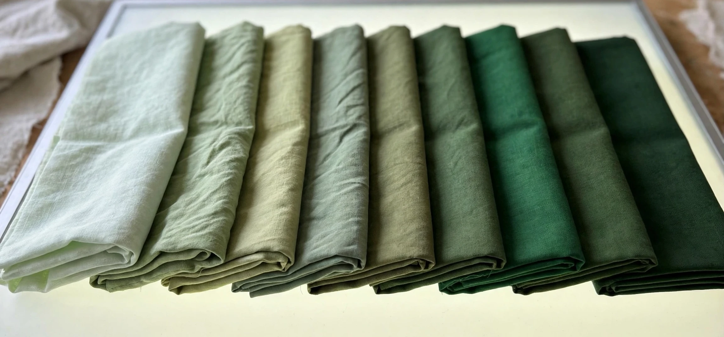
If you are picking a paint colour, designing a logo, choosing a dress, or trying to describe the exact green in a photograph, you need a practical vocabulary, and that is exactly what different names for green colors provides. This guide is organised the way you will actually use it: from the lightest, freshest greens through the bright mid-tones to the deepest, darkest shades, with notes on what each shade looks like, what it pairs with, and where it works best. It is a working reference you can return to whenever a green needs a name, rather than a history lesson, so every shade here is described by how it looks and how to use it.
Green is the hardest colour family to name precisely, because it covers such a wide range. At one end sit greens so pale they are almost white; at the other sit greens so dark they are almost black. In between are yellow-greens that feel like spring, blue-greens that feel like the sea, grey-greens that feel calm and grown-up, and vivid greens that feel electric and modern. No single list can capture every named shade, but a well-organised list can cover the shades you will actually meet in shops, paint charts, fashion, and design software, and can help you tell them apart without a colour chart in hand.
Table of Contents
- What ‘different names for green colors’ Covers
- How to Read ‘different names for green colors’ Like a Designer
- Light Greens: Fresh, Pale, and Pastel
- Bright Greens: Vivid, Lime, and Neon
- Medium Greens: Everyday, Natural, and Balanced
- Blue-Greens: Teal, Aqua, and Sea Tones
- Dark Greens: Deep, Rich, and Formal
- Grey-Greens and Muted Greens
- Choosing the Right Green Shade for Your Project
- Frequently Asked Questions
- Conclusion
What ‘different names for green colors’ Covers
When people look up different names for green colors, they want usable names, not technical codes. This guide therefore groups shades by appearance and use, rather than by chemistry or by the year a name was invented. Each section moves from lighter to darker within its family, so you can scan for the lightness you need and then choose the undertone: yellow-leaning for warmth, blue-leaning for coolness, or grey-leaning for softness. If you already know you want a pale green for a bedroom, start with the light section; if you want a bold green for a logo, start with the bright section; if you want a serious green for a suit or a study, start with the dark section.
A note on variation is important before you start. Colour names are not standardised across all brands. A paint company, a fashion label, and a design app may all use the name “mint” for slightly different shades, and screen settings can shift a colour further. Treat the descriptions here as reliable guides to the family and feel of each shade, and always check a physical swatch or a printed sample when an exact match matters, such as matching a wall to a sofa or a logo to a printed brochure. The name tells you where to look; the swatch confirms you have found it.
How to Read ‘different names for green colors’ Like a Designer
Designers read a green name in three parts: lightness, undertone, and intensity. Lightness is how pale or dark the shade is, from near-white pastels to near-black depths. Undertone is the hidden lean: yellow makes a green warm and sunny, blue makes it cool and crisp, grey makes it soft and muted, and brown makes it earthy. Intensity, sometimes called saturation, is how vivid or dull the shade is: a vivid green shouts, a muted green whispers. Once you can hear those three parts in a name, you can predict a shade you have never seen. A name with “lime” in it will be yellow-leaning and vivid; a name with “sage” or “grey” in it will be muted; a name with “deep” or “dark” in it will sit at the dark end of the scale.
Pairing follows the same logic. Warm greens pair well with warm neutrals such as cream, beige, terracotta, and warm wood, and with warm accent colours such as mustard, coral, and rust. Cool greens pair well with white, cool grey, navy, and silver, and with cool accents such as sky blue, lavender, and teal. Muted greens pair well with almost any neutral, which is why they are favourites for interiors and branding: they add colour without competing with other elements. Vivid greens need restraint: use them as accents against white, black, or dark neutrals, and let one vivid green do the talking rather than combining several.
Three Questions for Any Green
Whenever you meet a new green name, ask three questions. First, is it light, medium, or dark? Second, does it lean yellow, blue, or grey? Third, is it vivid or muted? Answering those three questions places almost any green name on the map in this guide, and it makes shopping, designing, and describing colours far easier. It also helps you explain what you want to a shop assistant or a designer: “a medium, muted, blue-leaning green” is a far clearer brief than “a nice green”, and it will get you to the right swatch much faster.
Light Greens: Fresh, Pale, and Pastel
Light greens are the easiest greens to live with, because they add colour while keeping a space or an outfit feeling open and bright. Mint is the best-known light green: a pale, cool, slightly blue pastel that feels clean, fresh, and a little retro. It suits bathrooms, kitchens, spring dresses, and baby rooms, and it pairs beautifully with white, cream, and soft grey. Pistachio is warmer and creamier, a pale yellow-green like the nut it is named after, with a soft, appetising quality that works in cafes, kitchens, and summer fashion.
Seafoam is a pale green with a hint of blue and grey, like foam on a wave, softer than mint and more coastal in feel. It is a favourite for beach houses, coastal weddings, and relaxed interiors, where it pairs with sand, driftwood, and white linen. Honeydew is even paler, a creamy, almost white green like the melon, useful when you want the faintest hint of green without committing to a visible colour. It works as a wall colour in small rooms, as a background in design, and as a delicate shade in bridal and baby clothing.
Other light greens worth knowing include tea green, a very pale yellow-green like brewed green tea, excellent for calm bedrooms and paper goods; spring green, a fresh, light, slightly yellow green like new leaves, lively without being loud; and pale lime, a light, yellow-leaning green that is softer than full lime but still energetic, good for children’s rooms, sportswear accents, and fresh branding. Together, these light greens cover the full range from barely-there to cheerfully fresh, and they are the safest starting point if you are new to using green.
Bright Greens: Vivid, Lime, and Neon
Bright greens are the loudest members of the family, and they are best used with intention. Lime green is the archetype: a vivid, yellow-leaning green like the fruit, energetic, youthful, and impossible to ignore. It suits sportswear, signage, youth branding, and accent walls, but it overwhelms a room if used on all four walls, so pair it with white, black, or dark grey and let it be the star. Chartreuse is close to lime but slightly more yellow and a touch more sophisticated, named after the French liqueur, with a distinctive, almost electric quality that appears in fashion, cocktail branding, and modern art.
Neon green is brighter still, a fluorescent, high-visibility green used for safety clothing, sports gear, and digital design where maximum attention is needed. It is a functional colour as much as a decorative one: it is designed to be seen from a distance, in low light, and against busy backgrounds. Kelly green is a vivid, pure, medium-bright green, named after the Irish surname and associated with St Patrick’s Day, sports teams, and festive clothing. It is brighter than most natural greens but less yellow than lime, sitting in a clear, confident middle that photographs well and reads clearly from a distance.
Bright greens also include apple green, a fresh, slightly yellow, medium-light green like a Granny Smith apple, crisp and cheerful, popular in kitchens, children’s products, and spring fashion; and electric green, a saturated, almost glowing green used in digital design and modern fashion for maximum impact. The rule for all bright greens is the same: use them as accents, pair them with neutrals, and resist the temptation to combine two bright greens in one scheme, because they will compete rather than complement each other.
Medium Greens: Everyday, Natural, and Balanced
Medium greens are the workhorses of the family: natural, balanced, and easy to use in large areas. Grass green is the reference point, a fresh, medium, slightly yellow green like a well-watered lawn, familiar and friendly, used for gardens, sports branding, and everyday clothing. Leaf green is similar but slightly deeper and more natural, like a healthy leaf in summer, with a grounded quality that suits outdoor brands, eco packaging, and natural interiors.
Emerald sits at the richer end of the medium range: a vivid, slightly blue, jewel-like green that is brighter than grass green and more luxurious in feel. It is a favourite for evening wear, jewellery, and statement interiors, where its richness reads as elegance rather than loudness. Jade is softer than emerald, a medium green with a milky, slightly grey quality like carved jade, calmer and easier to use in large areas such as sofas, curtains, and bedroom walls. Shamrock green is a medium, slightly yellow green associated with Ireland, festive and cheerful, often used for celebrations and team colours.
Other medium greens include fern green, a fresh, natural green like fern fronds, slightly yellow and outdoorsy, good for botanical prints and garden rooms; and moss green, a muted, earthy medium green like moss on stone, greyer and quieter than grass green, excellent for rustic interiors, camouflage-inspired fashion, and natural fabrics. Medium greens are the best choice when you want green to be the main colour rather than an accent, because they are strong enough to be visible but balanced enough to live with.
Blue-Greens: Teal, Aqua, and Sea Tones
Blue-greens sit on the border between green and blue, and they are some of the most popular shades in modern design. Teal is the best-known: a medium-dark blue-green, like the duck it is named after, sophisticated and versatile, used for bathrooms, kitchens, branding, and evening wear. It pairs with white, gold, coral, and navy, and it works in both traditional and contemporary rooms. Turquoise is lighter and brighter than teal, a vivid blue-green like the stone, tropical and lively, associated with beaches, jewellery, and summer fashion.
Aqua, short for aquamarine, is a light, clear blue-green like shallow tropical water, fresh and calming, popular for bathrooms, spas, and coastal interiors. Aquamarine itself is slightly paler and more gem-like, with a delicate, translucent quality. Viridian is a darker, richer blue-green, like the pigment, with a deep, almost jewel-like intensity that suits statement walls, velvet furniture, and formal clothing. Sea green is a medium blue-green with a grey undertone, like the sea on a cloudy day, muted and calming, excellent for bedrooms and relaxed living spaces.
Blue-greens are particularly useful when you want the calm of blue with the freshness of green. They suit bathrooms and bedrooms, where calm matters, and they suit branding for health, travel, and technology, where trust and freshness both matter. When choosing between them, check the blue-to-green balance: more blue feels cooler and more formal, more green feels fresher and more natural, and a grey undertone softens either direction.
Dark Greens: Deep, Rich, and Formal
Dark greens bring depth, formality, and drama. Forest green is the classic dark green: deep, shaded, and cool, like a dense woodland, rich without being bright. It suits front doors, libraries, velvet sofas, and winter coats, and it pairs with cream, brass, and natural wood for a traditional look, or with white and black for a modern one. Pine green is similar but slightly cooler and crisper, like pine needles in winter, with a clean, formal quality that works for tailored clothing, Christmas decoration, and traditional kitchens.
Hunter green is a dark, muted green with a grey or brown undertone, quieter than forest green and more country in feel, associated with hunting jackets, riding gear, and heritage clothing. Racing green is darker still, a very deep, formal green made famous by classic racing cars, almost black in low light, with a heritage, luxury quality that suits classic cars, leather goods, and formal evening wear. Bottle green is a close cousin, a very dark, glossy green like old glass bottles, used for school uniforms, blazers, and traditional furnishings.
Other dark greens include pine forest tones, deep moss shades, and near-black greens such as dark slate green, which is so dark it reads as charcoal with a green hint in some lights. Dark greens are best used where you want impact and intimacy: a feature wall, a study, a front door, or a statement piece of furniture. In small or dark rooms, balance them with light walls, mirrors, and good lighting, so the depth adds drama without making the space feel closed in.
Grey-Greens and Muted Greens
Grey-greens are the quiet achievers of the green family, and they have become modern neutrals in their own right. Sage is the most popular: a soft, dusty grey-green like sage leaves, calming and versatile, pairing with cream, white, linen, and natural wood. It suits bedrooms, kitchens, weddings, and branding, because it adds colour without demanding attention. Eucalyptus is similar but slightly cooler and bluer, like eucalyptus leaves, with a fresh, spa-like quality that suits bathrooms and wellness branding.
Olive is a muted, yellow-brown green, earthier than sage and more utilitarian, appearing in workwear, military-inspired fashion, and rustic interiors. It pairs with cream, tan, black, and denim, and it flatters a wide range of skin tones. Laurel is a dusty, grey-green like laurel leaves, elegant and understated, used for stationery, weddings, and soft furnishings. Artichoke green is a muted, grey-yellow green like the vegetable, sophisticated and food-inspired, appearing in kitchens and upmarket interiors.
Muted greens are the best choice when you want a scheme to feel calm, grown-up, and timeless. They age well, they pair with changing accent colours, and they rarely clash with existing furniture. If you are decorating a room you will live with for years, or choosing a brand colour that must work across many contexts, start with the muted family and add brighter greens only as accents.
| Shade family | Example names | Best for |
|---|---|---|
| Light greens | Mint, pistachio, seafoam, honeydew, tea green | Small rooms, bathrooms, spring fashion, calm spaces |
| Bright greens | Lime, chartreuse, kelly, apple, neon green | Accents, sportswear, signage, youth branding |
| Medium greens | Grass, leaf, emerald, jade, fern, moss | Main colour in rooms, clothing, and branding |
| Blue-greens | Teal, turquoise, aqua, viridian, sea green | Bathrooms, coastal rooms, health and travel brands |
| Dark greens | Forest, pine, hunter, racing, bottle green | Feature walls, front doors, formal wear, libraries |
| Grey-greens | Sage, eucalyptus, olive, laurel, artichoke | Calm neutrals, kitchens, weddings, timeless schemes |
For more colour reading, see our guides on colour guides, analogous colours, and colour and background text combinations.
Choosing the Right Green Shade for Your Project
Choosing a green shade starts with the job it must do. For a bedroom or bathroom, prioritise calm: light greens, blue-greens, or grey-greens will help the room feel restful. For a living room or kitchen, you have more freedom: medium greens make a warm, natural statement, while dark greens on one wall add drama without overwhelming the space. For a logo or brand, prioritise clarity and distinctiveness: a medium or bright green reads clearly at small sizes, while a muted green reads as premium and understated. For clothing, prioritise skin tone and occasion: warm greens suit warm tones and casual settings, cool greens suit cool tones and formal settings, and muted greens suit almost everyone.
Always test before committing. Paint a large sample and view it in morning, afternoon, and evening light, because green is especially sensitive to light changes: a sage can look grey in one light and green in another, and a teal can look blue in daylight and green under lamps. For fabric, drape the sample over furniture or hold it against your skin in daylight before ordering. For digital design, check the colour on several screens, because screens vary widely in how they display green. A few minutes of testing prevents the most common green disappointment: a shade that looked perfect in the shop but different at home.
Pairing Greens With Other Colours
Green pairs with more colours than most people realise. With white and cream, any green feels fresh and clean. With black and charcoal, dark and bright greens feel modern and dramatic. With wood tones, medium and muted greens feel natural and grounded. With pink and coral, green feels floral and romantic, because it echoes leaves and petals. With gold and brass, dark greens feel luxurious. With navy, teal and forest greens feel classic and trustworthy. The safest approach is to choose one green as the lead, one neutral as the base, and one accent for contrast, and to let the green lead rather than competing with several other strong colours.
Frequently Asked Questions
What is the lightest shade of green?
Honeydew and tea green are among the lightest named greens, so pale they are almost white with a faint green hint. Mint and seafoam are the next step up: clearly green, but still pale and pastel.
What is the difference between teal and turquoise?
Teal is a medium-dark blue-green, sophisticated and muted, while turquoise is lighter, brighter, and more vivid. Teal leans more towards deep sea tones; turquoise leans more towards tropical water.
What is lime green?
Lime green is a vivid, yellow-leaning green like the lime fruit. It is energetic and attention-grabbing, best used as an accent with white, black, or dark grey.
What green goes with grey?
Almost any green pairs with grey, but sage, eucalyptus, forest, and emerald are particularly reliable partners. Grey softens bright greens and sharpens muted greens, making it a versatile base.
How do I pick a green paint colour?
Decide on lightness first, then undertone: yellow for warmth, blue for coolness, grey for softness. Test a large sample in the room at different times of day before committing, and pair it with one neutral and one accent.
Conclusion
From honeydew and mint through lime and kelly to teal, emerald, forest, and sage, the names for green shades give you a practical map of a very wide colour family. The trick is not to memorise every name, but to read each name for lightness, undertone, and intensity, and to choose the family that matches your project: light for calm, bright for energy, medium for everyday use, blue-green for coastal calm, dark for drama, and grey-green for timeless versatility. Test your choice in real light, pair it with one neutral and one accent, and let the green do its work. With that approach, the next green you need a name for will already have one waiting.