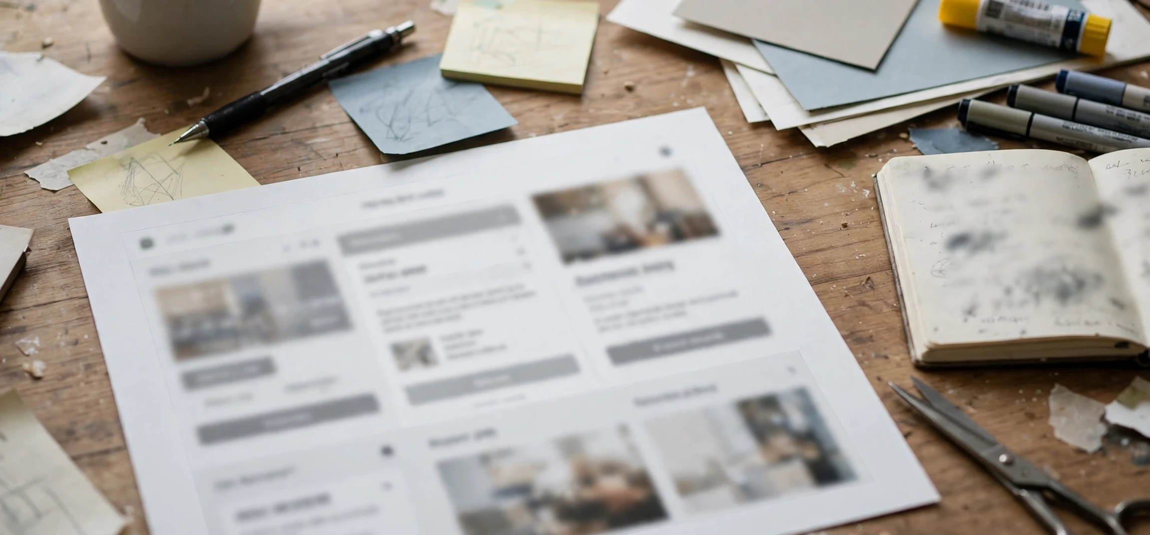
If you have ever been shown a rough version of a website, a product, or a building before the real thing was built, you have probably seen a mock-up. The mock-up definition is simple at its core: a mock-up is a scale or full-size model of a design or device, made to test an idea, show how something will look, or practise how it will work. Mock-ups appear in graphic design, web design, product development, architecture, film making, and even in training, and they range from a quick paper sketch to a detailed digital model that looks almost finished. Understanding the mock-up definition helps you recognise what you are looking at, what it can prove, and what it cannot.
The word is written in several ways, including mock-up, mockup, and mock up, and the meaning shifts slightly with the industry. A graphic designer may mean a realistic preview of a logo on a business card or a book cover. A software team may mean a clickable screen layout with no real data behind it. An engineer may mean a physical prototype built from foam or cardboard to check size and shape. All of these share the same purpose: to make an idea visible and testable before time and money are spent on the final version. This guide explains the mock-up definition in full, compares mock-ups with related terms, and shows how they are used in practice.
The mock-up definition in Plain English
At its simplest, the mock-up definition is a model built for demonstration, testing, or teaching. The word “mock” here means imitation rather than ridicule: a mock-up imitates the real thing closely enough to be useful, without being the real thing itself. A mock-up of a shop front lets an owner see the signage and layout before builders arrive. A mock-up of a phone app lets a client tap through screens before programmers write the final code. A mock-up of a military vehicle lets a crew practise maintenance without risking an expensive working machine. In each case, the mock-up stands in for the finished product during a stage when changes are still cheap and easy.
Two qualities matter most in a good mock-up. First, it must be faithful enough in the aspects being tested. If the question is “does this layout look right”, the mock-up needs accurate colours, sizes, and spacing. If the question is “can a person reach this control”, it needs accurate physical dimensions. Second, it must be honest about what it is not. A mock-up that looks finished can mislead people into thinking the work is nearly done, when the underlying structure, data, or engineering may barely exist. Good designers therefore label mock-ups clearly and explain which parts are real and which are placeholders.
The history of the mock-up definition also helps explain its range. The term comes from workshop and manufacturing practice, where a “mock-up” was a full-size dummy built to check fit and form. As design work moved onto computers, the term moved with it, and digital mock-ups became a standard step in branding, web design, and app development. Today the word covers both traditions: physical models made of paper, foam, wood, or plastic, and digital models made in design software, sometimes with interactive elements added.
Types Covered by the mock-up definition
One reason the mock-up definition can feel confusing is that it covers several distinct types of model. A low-fidelity mock-up is rough and quick: a hand-drawn sketch, a paper cut-out, or a grey box layout that shows structure without detail. Its value is speed. A team can produce several low-fidelity mock-ups in an afternoon, compare them, and discard the weak ideas before anyone becomes attached to them. A high-fidelity mock-up, by contrast, is detailed and polished: it uses real colours, real type, real images, and realistic proportions, so it looks close to the finished product. Its value is realism, and it is often used to win approval from a client or a manager.
Physical mock-ups remain important wherever size, weight, and touch matter. Architects build scale models of buildings and interiors so clients can walk around a design in miniature. Product designers build foam models of kettles, chairs, or hand tools to test grip and balance. Car makers build full-size clay models to judge the shape of a new vehicle from every angle. These physical mock-ups catch problems that a screen cannot show, such as a handle that is awkward to hold or a doorway that feels too narrow when you stand beside it.
Digital mock-ups dominate in graphic and web design. A branding mock-up places a logo onto a photograph of a shop sign, a coffee cup, a van, or a stationery set, so the client can judge how the brand will look in the real world. A website mock-up shows the homepage layout, navigation, and content blocks before any code is written. An app mock-up shows each screen in sequence, sometimes linked so that tapping a button moves to the next screen. These digital mock-ups are cheap to revise, easy to share, and useful for gathering feedback from people who are not in the same room.
Mock-Ups in Print and Branding
In print and branding, the mock-up definition usually means a realistic preview image. A designer who has created a book cover will show it wrapped around a three-dimensional book image, complete with shadow and page edges, rather than as a flat rectangle. This helps the client imagine the book on a shelf. The same applies to packaging, posters, clothing, and vehicle wraps. The mock-up does not prove that the print will be perfect, since paper stock, ink, and lighting all affect the final result, but it gives a far better impression than a flat file alone.
Mock-Ups in Software and Web Design
In software, the mock-up definition often overlaps with wireframes and prototypes, but the three are not identical. A wireframe is usually a bare structural sketch showing where elements go, without styling. A mock-up adds visual design: colours, fonts, images, and spacing. A prototype adds interaction: buttons that can be clicked, forms that can be filled, and screens that link together. Many projects move through all three stages in order, refining the idea at each step, and the mock-up stage is where a design first starts to look like the product people will actually use.
mock-up definition Versus Prototype, Wireframe, and Model
Confusion around the mock-up definition usually comes from its neighbours. A prototype is a working early version built to test function: it may use real materials, real code, or real mechanics, and it is expected to behave like the final product in the ways being tested. A mock-up, by contrast, is mainly for appearance and layout, and it may not work at all. A product team might build a mock-up to agree the look of a device, then build a prototype to test whether its buttons, battery, and software work together. Both are early versions, but they answer different questions.
A wireframe sits earlier in the process. It is a skeletal drawing of a page or screen, often in grey boxes and placeholder text, used to agree structure before visual design begins. A mock-up builds on the wireframe by adding the visual layer. A model is the broadest term of all: it can mean a small-scale replica, a mathematical model, or a fashion model, depending on context. When people say “model” in a design meeting, they may mean a mock-up, a prototype, or a scale replica, so it is worth asking which one they mean and what question it is supposed to answer.
The practical difference matters because each tool has a different cost and a different risk. Showing a client a polished mock-up too early can create an expectation that the product is almost finished, leading to disappointment when development takes months. Showing only a wireframe can leave a client unable to imagine the final look, leading to vague feedback. Experienced teams therefore choose the fidelity of the mock-up to match the decision at hand: rough for early choices, polished for final approval, and always labelled so everyone knows what stage the work has reached.
Why the mock-up definition Matters in Real Projects
The mock-up definition matters because mock-ups save money by catching mistakes early. Changing a layout on paper costs almost nothing. Changing a printed package run, a manufactured product, or a coded website costs a great deal more. A mock-up lets a team test assumptions while they are still cheap to fix: Is the headline readable at a distance? Does the navigation make sense? Does the product fit in its packaging? Does the control panel feel natural to use? Each question answered at the mock-up stage is a costly rework avoided later.
Mock-ups also improve communication. Clients, managers, and users often struggle to judge an idea from a written description or a spreadsheet of specifications. A visual model gives everyone the same thing to look at and discuss, and it surfaces disagreements early, when they are easy to resolve. A client who sees a mock-up can say “move this button” or “this colour feels wrong” in a way that a specification document rarely invites. That feedback loop is one of the main reasons mock-ups became standard practice across design industries.
There is also a training and safety role in the mock-up definition. Full-size mock-ups of aircraft cabins, train carriages, hospital wards, and military equipment let people practise procedures without the cost or danger of using the real thing. A maintenance crew can learn to reach a component on a mock-up engine before working on a live aircraft. A medical team can rehearse a ward layout on a mock-up before a hospital opens. In these cases the mock-up is not a marketing tool at all; it is a rehearsal space.
How to Make a Good Mock-Up
Making a useful mock-up starts with a clear question. Before opening design software or cutting foam, decide what the mock-up must test: appearance, size, layout, interaction, or all of these. That decision sets the fidelity. A layout question needs only a rough model. An appearance question needs realistic colours and materials. An interaction question needs clickable screens or moving parts. Trying to answer every question with one mock-up usually produces a model that is expensive and still unclear, so it is better to build a small number of focused mock-ups than one grand model that tries to do everything.
Next, use realistic content wherever the content affects the judgement. Placeholder text and grey boxes are fine for structure, but they hide real problems: a headline that wraps badly, a menu that overflows, or a label that is too long for its space. Using real headings, real product names, and realistic amounts of text reveals those issues while they are still easy to fix. The same applies to images: a real photograph shows colour and contrast problems that a grey box never will. This is one of the most common lessons in the mock-up definition in practice, and it applies equally to print, web, and product work.
Finally, present the mock-up with its limits stated plainly. Tell viewers what is final and what is placeholder, what has been tested and what has not, and what feedback is wanted. Ask specific questions rather than “what do you think”, because specific questions produce usable answers. When feedback arrives, revise the mock-up and show the changes, so reviewers can see that their input mattered. That cycle of mock-up, feedback, and revision is the heart of good design, and it is far cheaper than revising a finished product.
| Mock-Up Type | Typical Fidelity | Best Used For |
|---|---|---|
| Paper sketch or wireframe | Low | Early layout and structure choices |
| Digital branding mock-up | High | Showing a logo or package in real-world context |
| Clickable screen mock-up | Medium to high | Testing navigation and screen flow |
| Foam or cardboard model | Low to medium | Testing size, grip, and physical fit |
| Full-size training mock-up | High | Rehearsing procedures safely |
Frequently Asked Questions About the mock-up definition
Is it spelled mock-up, mockup, or mock up?
All three forms appear, and all are understood. “Mock-up” is the traditional hyphenated form, “mockup” is common in software and product contexts, and “mock up” as two words is often used as a verb, as in “to mock up a design”. Whichever form you use, the mock-up definition remains the same: a model made to demonstrate or test an idea.
What is the difference between a mock-up and a prototype?
A mock-up mainly shows appearance and layout and may not function, while a prototype is built to test how something works. A mock-up answers “does this look right”, and a prototype answers “does this work right”. Many projects use both, in that order.
Are mock-ups expensive to make?
They can be very cheap or quite costly, depending on fidelity. A paper sketch costs almost nothing, a digital branding mock-up costs a designer’s time, and a full-size physical mock-up of a vehicle or a building interior can be a major project. The point is that each is far cheaper than revising the finished product.
Do I need special software to make a digital mock-up?
Not necessarily. Simple mock-ups can be made in presentation software or even a word processor, and many free and paid design tools offer templates for common mock-ups such as books, phones, and shop signs. Dedicated design software gives more control over realism, but the idea matters more than the tool.
Should I show a client a rough or polished mock-up?
Show a rough mock-up when the decision is about structure or direction, and a polished mock-up when the decision is about final approval. In both cases, label the mock-up clearly so the client knows which parts are finished and which are placeholders.
Putting the mock-up definition to Work
Putting the mock-up definition to work is mostly a matter of matching the model to the decision. If the decision is about layout, a rough mock-up is enough, and polishing it further wastes time. If the decision is about final approval, a polished mock-up is worth the effort, because it shows the client exactly what they are approving. Teams that keep the mock-up definition in mind at each stage tend to waste less work, because they never build a high-fidelity model for a low-stakes question, and never ask a client to approve a final design from a rough sketch. The discipline is simple: decide the question first, then choose the fidelity that answers it.
It also helps to keep a small library of past mock-ups, because the mock-up definition covers models that are often reusable. A branding mock-up built for one product can be adapted for the next, a screen layout that tested well can become a template, and a physical model that revealed a grip problem can remind a new team of a lesson already learned. Reuse does not mean copying blindly; each new project still needs its own questions and its own feedback. But a team that treats mock-ups as a reusable part of its process, rather than as throwaway sketches, gets faster and more consistent results over time.
Conclusion: Using the mock-up definition Well
The mock-up definition boils down to a simple and powerful idea: build a stand-in for the real thing, learn from it, and improve the design before the costly work begins. Whether the mock-up is a pencil sketch, a digital brand preview, a clickable app layout, or a full-size training model, its job is the same: to make an idea visible, testable, and discussable. Teams that use mock-ups well catch errors early, communicate clearly, and deliver products that feel considered rather than rushed. The next time someone shows you a mock-up, ask what question it is meant to answer, and you will understand both the model and the project behind it far better. For related explanations, see our guides on the meaning and definition of business, text runaround in InDesign, and mean definition in maths.