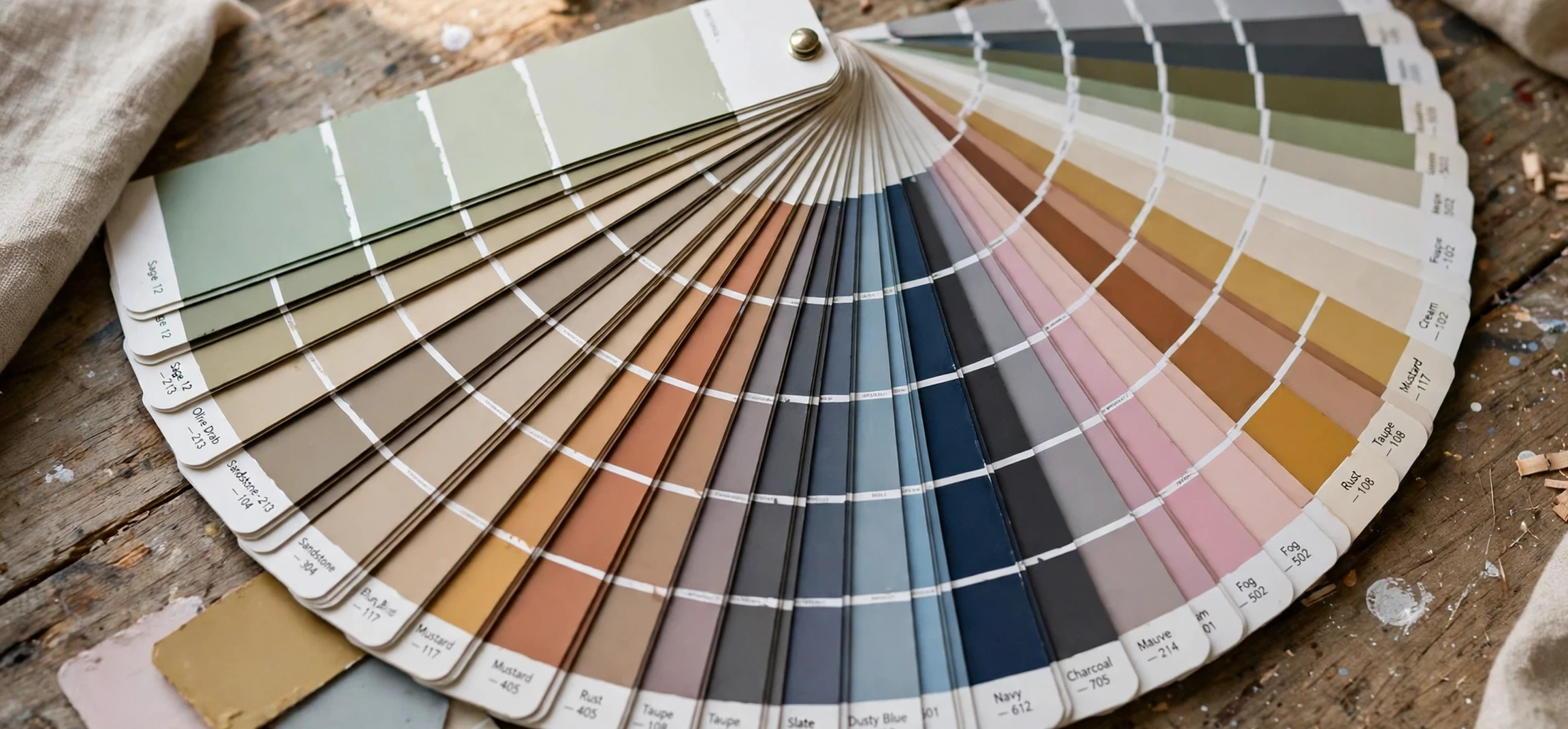
If you have ever wondered how a designer in one country and a printer in another country can agree on exactly the same shade of blue, the answer is usually a pantone pms color guide. A pantone pms color guide is a printed reference book that shows standardised colours, each with its own code, so that everyone involved in a project is talking about the same colour. Instead of describing a colour with vague words such as light blue or dark teal, a designer can point to a single numbered swatch and say, use this one. That simple idea has made the pantone pms color guide a standard tool in graphic design, packaging, fashion, product design, and printing for many decades.
This guide explains what a pantone pms color guide is, how it works, and how designers use it in everyday work. You will learn what the letters PMS stand for, how the colour system is organised, why printed colours can look different from colours on a screen, and how to read a swatch correctly. Whether you are a student, a small business owner ordering printed materials, or simply curious about how brand colours stay consistent, this neutral explainer will give you a clear picture of the system without any sales talk or pricing claims.
What Is a Pantone PMS Color Guide?
A pantone pms color guide is a physical book, or set of books, containing printed samples of colours from the Pantone Matching System, often shortened to PMS. Each colour in the system has a unique number and name. When a designer specifies a colour by its Pantone number, a printer can mix inks to match that standard as closely as possible. The guide itself is the reference: it shows what each numbered colour is supposed to look like when printed on a particular type of paper.
The key point is standardisation. Computer screens display colours using light, while printers produce colours using ink on paper. Those two methods do not behave in the same way, so a colour that looks bright on a monitor can look duller in print. A pantone pms color guide bridges that gap by giving everyone a shared physical reference. If the designer, the client, and the printer all look at the same guide, they can agree on the result before anything is printed in bulk.
Guides are usually organised into collections. Some collections focus on colours for coated paper, which has a smooth, glossy finish, while others focus on uncoated paper, which absorbs more ink and looks more matte. The same Pantone number can therefore appear slightly different in different guides, because the paper changes how the ink looks. Good designers always check which guide their printer is using, so the expectation matches the finished product.
How the Pantone PMS Color Guide System Works
The system works through numbered colours and carefully mixed inks. In traditional spot-colour printing, each Pantone colour is printed with its own pre-mixed ink, rather than being built from the four standard process inks used in most everyday printing. That is why a brand colour can look so consistent across business cards, packaging, and signage: the same ink formula is used each time.
Each swatch in a pantone pms color guide shows the colour, its number, and sometimes a suggested formula or a set of values for digital use. Designers pick colours from the guide, note the numbers, and pass those numbers to the printer along with the artwork. The printer then follows the standard formula for that number. This workflow removes guesswork and reduces the back-and-forth that happens when colours are described only in words.
It is worth noting that the guide is a reference, not a guarantee of perfection. Lighting, paper stock, ink batches, and printing presses can all cause small variations. That is why professionals view guides under standard daylight or controlled lighting, keep guides away from direct sunlight, and replace old guides when the printed swatches fade. A well-kept guide is a reliable tool; a faded, sun-damaged guide is not.
Coated and Uncoated Guides Explained
One of the most common sources of confusion for beginners is the difference between coated and uncoated guides. Coated paper has a sealed surface, so ink sits on top of it and colours tend to look richer and sharper. Uncoated paper is more porous, so ink sinks in slightly and colours tend to look softer and a little less saturated. A pantone pms color guide for coated paper and one for uncoated paper therefore show the same colour numbers with visibly different results.
Choosing the right guide matters when a project will be printed on a specific stock. A logo designed for glossy packaging should be checked against a coated guide, while a letterhead printed on textured, uncoated paper should be checked against an uncoated guide. Designers who skip this step sometimes approve a colour on screen or in the wrong guide, and are then surprised by the printed result. Taking a few minutes to check the correct guide saves time, money, and reprints.
Many guides also include sections for special finishes, such as metallic or pastel colours. These colours behave differently again, because metallic inks contain reflective particles and pastels use lighter ink mixes. They are a reminder that colour is not just a number on a screen: it is a physical material, and the material changes the appearance.
Using a Pantone PMS Color Guide in Design Projects
In a typical design project, the guide is used at several stages. First, during the concept stage, the designer flips through the guide to find colours that fit the mood of the brand or product. A fresh food brand might lean towards greens, while a technology company might prefer deep blues or greys. The guide makes it easy to compare similar shades side by side, which is much harder on a screen where backlighting changes perception.
Next, during the approval stage, the designer shows the client the physical swatches. This is far more reliable than sending a screenshot, because every screen shows colours slightly differently. Once the client approves a swatch, the number is recorded in the brand guidelines, so future designers and printers can reproduce the same colour years later. For more on how guides fit into broader design workflows, see our comprehensive design guide and our InDesign layout guide.
Finally, during production, the printer uses the guide as the target to match. Press operators compare printed proofs against the guide under standard lighting and adjust the ink until the match is close. This step, called proofing, is where the guide proves its value. Without a shared reference, proofing would depend entirely on personal opinion, and two people could easily disagree about whether a colour is right.
Print Colour Versus Screen Colour
Understanding the difference between print and screen colour helps explain why a pantone pms color guide still matters in a digital age. Screens create colour with red, green, and blue light. Printers create colour with ink, usually cyan, magenta, yellow, and black, or with pre-mixed spot inks. Because the two systems use different methods, not every screen colour can be reproduced exactly in print, and not every print colour can be shown exactly on a screen.
This is why designers never rely on a monitor alone for print work. Monitors vary in brightness, calibration, and age, and a colour can look different on a laptop, a phone, and a desktop monitor. A printed guide removes that variation. It is also why brand guidelines usually list both a Pantone reference for print and a separate set of values for screens and websites. Each medium gets the version of the colour that works best for it, while the Pantone number remains the anchor for print.
For students learning design, a useful exercise with a pantone pms color guide is to pick a colour from a guide, then view its digital equivalent on two different screens and in print. The differences are usually obvious, and they teach an important lesson: colour is contextual. The same number can look different depending on light, surface, and medium, and a professional designer plans for that.
Choosing Colours With a Pantone PMS Color Guide
Choosing colours is partly technical and partly creative. A pantone pms color guide helps with both sides. Technically, it shows which colours reproduce well in print and which ones are trickier. Creatively, it lets a designer explore combinations, such as pairing a bold main colour with a softer supporting colour, and see how they look together on paper rather than on a glowing screen.
When choosing a palette with a pantone pms color guide, designers often start with the purpose of the project. A colour that works for a luxury product may not work for a children’s product, and a colour that reads well on packaging may not read well on a small business card. The guide helps here because swatches can be held against real materials, placed next to product samples, and viewed in natural light. This hands-on approach often reveals problems that a screen hides, such as two colours that look distinct on a monitor but blur together in print.
It is also good practice to limit a palette to a small number of colours. Too many colours can make a design feel busy and can increase printing costs, especially when each colour needs its own ink. A guide makes it easy to test a restrained palette: pick two or three swatches, place them together, and judge the combination as a whole before committing to it.
Pantone PMS Color Guide at a Glance
The table below summarises the main ideas covered in this guide, so you can refer back to them quickly when starting a print project.
| Topic | What it means | Why it matters |
|---|---|---|
| Spot colour | A pre-mixed ink for one specific colour | Keeps brand colours consistent across print runs |
| Coated guide | Swatches printed on smooth, glossy paper | Shows how colours look on coated packaging and covers |
| Uncoated guide | Swatches printed on porous, matte paper | Shows how colours look on letterheads and textured stock |
| Proofing | Comparing a printed proof against the guide | Catches colour problems before a full print run |
| Brand guidelines | A record of approved colour numbers | Lets future designers reproduce the same colours |
Caring for Your Guide
A pantone pms color guide is a working tool, and like any tool it needs care. Because a pantone pms color guide is printed on real paper, its swatches fade with light and time, so a pantone pms color guide should be stored carefully and replaced when its colours no longer match the standard. Keep it away from sunlight, moisture, and dusty environments, because all three can fade or stain the swatches. Handle pages by their edges where possible, and avoid writing on swatches. Many studios store guides in protective cases and replace them on a regular cycle, because even a well-kept guide will fade slowly over time.
It is also sensible to note the edition or year of a guide when recording colour numbers. Colour standards are updated from time to time, and a number can be revised or renamed. Recording the edition alongside the number helps future printers understand exactly which reference was used. If a project is reprinted years later, that small detail can prevent a mismatch.
For anyone who works with colour regularly, the guide is also a learning tool. Flipping through it builds an eye for subtle differences between similar shades, and that skill transfers to every other part of design, from choosing website colours to selecting product materials. The guide teaches patience too: good colour choices are made slowly, by comparison, not by picking the first bright shade on a screen.
Frequently Asked Questions
What does PMS stand for?
PMS stands for Pantone Matching System. It is a standardised colour system that assigns a number to each colour, so designers and printers can refer to the same colour without relying on vague descriptions.
Why do printed colours look different from screen colours?
Screens use light to create colour, while printers use ink on paper. The two methods produce different ranges of colour, and monitors also vary in calibration. A printed guide gives everyone a shared physical reference that screens cannot provide.
Do I need both coated and uncoated guides?
It depends on your work. If you only ever print on one type of paper, one guide may be enough. If you work across packaging, stationery, and marketing materials, having both guides helps you check colours against the paper they will actually be printed on.
Can a pantone pms color guide be used for digital design?
Yes, as a starting point. Designers often choose a colour from the guide and then use its published digital values for screens. However, the guide itself is a print reference, so screen colours should always be checked on real devices before launch.
Conclusion
A pantone pms color guide is a simple idea with a large impact: a shared, numbered reference that lets designers, clients, and printers agree on colour before anything is printed. By understanding coated and uncoated guides, the difference between print and screen colour, and the role of proofing, you can make better colour choices and avoid costly surprises. Whether you are approving a logo, ordering packaging, or studying design, the guide remains one of the most practical tools in the field. For a broader look at colour topics, you may also enjoy our colour guide article. Keep your guide in good condition, record colour numbers carefully, and always check the physical swatch before approving a print run.