If you have ever tried to describe a sunset, a favourite jumper, a paint swatch or a brand logo, you have probably discovered that the word orange on its own is not enough, which is exactly why people search for other names for the color orange. Orange covers a wide family of shades, from pale peachy tints that barely blush the page to deep rusts and burnt tones that feel almost brown, and from bright citrus shades that demand attention to soft, dusty versions that sit quietly in a room. This guide collects the most useful other names for the color orange, explains what each one looks like, and shows where each shade works best, whether you are decorating, dressing, designing, painting or simply trying to find the right word.
Colour names are useful because they carry associations as well as hues. Saying tangerine instantly suggests fruit, freshness and energy, while saying terracotta suggests clay, warmth and handmade craft, even though both sit inside the orange family. Learning the vocabulary helps you shop more accurately, brief a designer more clearly, and write descriptions that readers can actually picture. It also helps you avoid the frustration of ordering something labelled orange and receiving a shade that looks nothing like the one in your head.
Why There Are So Many other names for the color orange
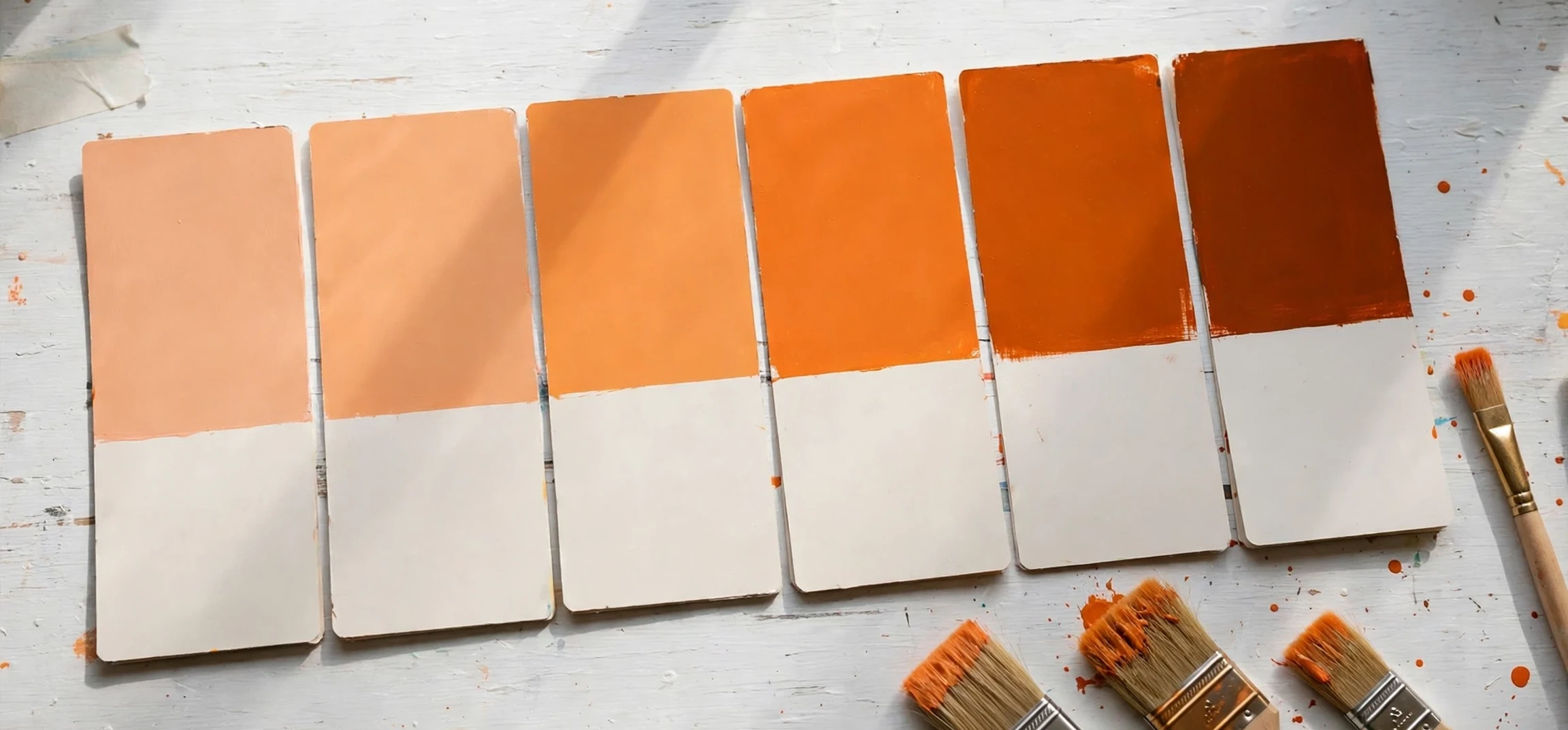
There are so many other names for the color orange because orange sits between red and yellow, and every step along that spectrum feels different. Move a little toward red and the shade becomes warmer, deeper and more dramatic. Move a little toward yellow and it becomes brighter, lighter and more playful. Add white and you get soft pastels. Add black or brown and you get earthy, muted tones. Add grey and you get dusty, sophisticated versions that work well in interiors. Each shift deserves its own name, because each shift changes the mood of a room, an outfit or a design.
Many orange names also come from the natural world, which makes them easy to remember. Fruits give us tangerine, apricot, peach, mango, persimmon, papaya and cantaloupe. Minerals and earth give us ochre, rust, copper, bronze and terracotta. Flowers give us marigold and nasturtium. Everyday life gives us pumpkin, carrot, flame, sunset and amber. When a colour name comes from something you can picture, you do not need a chart to understand it, and that is why these names survive in shops, paint ranges and fashion collections year after year.
How to Read This Guide
The shades below are grouped by feeling rather than by strict technical measurement, because that is how most people actually choose colour. A pale orange for a bedroom wall behaves differently from a vivid orange for a poster, even if both are technically orange. Where a common reference value is widely listed for a shade, it is given as a starting point for searching, not as a rule: screens, printers, fabrics and paints all render colour slightly differently, so always check a physical swatch before committing to a large purchase or a print run.
Warm and Fruity other names for the color orange
The fruity branch of the family is the most familiar, and it is a good place to start. Tangerine is a bright, juicy orange with a slight red warmth, the colour of the fruit itself, and it works beautifully for packaging, sportswear, children’s products and any design that needs instant energy. Apricot is softer and paler, a gentle orange-pink that feels warm without shouting, making it popular for bedrooms, wedding palettes and spring clothing. Peach is even lighter and pinker, a classic pastel orange that flatters skin tones and softens a room, while nectarine sits between peach and tangerine, a little deeper and a little more saturated.
Mango brings a golden, sunny quality, an orange that leans toward yellow and feels tropical and optimistic. Papaya is similar but slightly softer and more muted, like the flesh of the fruit, and it works well in resort wear, food branding and relaxed interiors. Persimmon is deeper and redder, a rich autumnal orange that feels luxurious in knitwear, leather goods and fall decorating. Cantaloupe is pale, sweet and melon-like, a light orange that pairs well with cream, sage and soft grey. These fruity other names for the color orange are especially useful when you want warmth without heaviness, because they read as fresh and friendly rather than formal.
Citrus Shades for Energy
Within the fruity group, the citrus shades deserve their own note. Orange itself, tangerine and a shade often called citrus orange are the high-energy end of the family. They advance visually, which means they appear to come forward in a design, and they attract the eye quickly. That makes them excellent for calls to action, sale signage, sports branding and children’s spaces, but also means they should be used in controlled amounts in a calm room. A single citrus cushion, poster or front door can lift a whole space; four citrus walls can overwhelm it.
Soft, Pale and Muted Orange Shades
Not every orange wants to shout. The soft end of the family includes peach, apricot, salmon, coral and shell pink-orange tones that bring warmth to a space without dominating it. Salmon is a pink-orange that feels a little more grown-up than peach, and it has long been a favourite for shirts, dresses and soft furnishings. Coral is brighter than salmon and pinker than tangerine, a lively but still wearable shade that suits both summer clothing and coastal interiors. Shell is paler still, a whisper of orange that works almost like a warm neutral, pairing well with white, linen and natural wood.
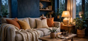
Dusty and muted oranges are equally important. A dusty peach or a muted clay orange can make a room feel warm and lived-in without looking themed. These shades are popular in modern interiors because they add warmth to grey, beige and white schemes without the intensity of a vivid orange. They also photograph well, which matters for anyone styling a home, a product or a social feed. If you love orange but worry about it feeling too loud, start at this end of the family and work brighter only in small accents.
Peach, Coral and Salmon Explained
People often confuse peach, coral and salmon, so here is a simple way to keep them straight. Peach is the palest and pinkest, soft and gentle. Salmon is a step deeper and slightly more orange, like the colour of cooked salmon. Coral sits brighter and more vivid than both, with a pink-orange glow that feels tropical. If you are choosing between them for clothing, hold each shade near your face in natural light: peach tends to flatter most skin tones softly, salmon adds a little more presence, and coral makes a bolder statement. The same test works for paint: try a large swatch on the wall and live with it for a day before deciding.
Deep, Dark and Earthy Orange Tones
At the deep end of the family, orange becomes grounded, serious and rich. Burnt orange is the best-known example, a dark, reddish orange that feels autumnal and confident, widely used in fashion, furniture and retro-inspired design. Rust is darker and browner, the colour of oxidised metal, and it brings an industrial, vintage warmth to leather, denim and exposed brick schemes. Terracotta is the colour of fired clay, a warm earthy orange-brown that feels handmade and Mediterranean, perfect for pots, tiles, kitchens and garden spaces. Sienna, especially burnt sienna, is a reddish-brown orange beloved by painters, while ochre is a golden, earthy yellow-orange that has been used as a pigment since ancient times.
Copper and bronze sit at the metallic edge of the family. They are not flat colours but finishes, oranges warmed by a metallic sheen, and they work beautifully for lighting, jewellery, hardware and festive decorating. A copper lamp or a bronze frame adds orange warmth through reflection rather than through solid colour, which makes these tones easier to live with in a formal room. For anyone exploring warm palettes more broadly, our American Spirit colour guide is a useful companion read on how warm shades are described and combined.
Autumn and Heritage Oranges
Autumn palettes rely heavily on this deep group. Pumpkin is the cheerful face of autumn, a strong, warm orange associated with harvest and seasonal decorating. Carrot is brighter and more straightforward, a clean mid-orange. Marigold is golden and floral, a yellow-orange that feels sunny even in a darker scheme. Together with rust and burnt orange, these shades create the classic fall combination: warm, layered and comforting. They also work well in heritage and rustic interiors, where natural materials such as wood, wool, leather and stone already carry warm undertones.
Bright, Bold and Vivid Orange Names
Some occasions call for orange at full volume. Flame is a vivid, slightly red orange that suggests fire and movement, popular for sport, safety and dramatic design. Sunset orange describes the intense, glowing band of colour seen as the sun goes down, a shade that blends orange with pink and red and works beautifully in photography, art prints and gradient designs. Tangerine and vivid orange itself belong here too, along with shades sometimes called international orange, a highly visible orange used for safety equipment and aerospace markings, and neon orange, a fluorescent version designed to be seen from a distance.
Bright oranges need careful handling. Because they advance and attract attention, they are best used as accents: a front door, a feature wall, a statement chair, a logo mark, a book cover or a single garment. Paired with neutrals such as navy, charcoal, cream or white, a bright orange looks intentional and modern. Paired with too many other brights, it can quickly become chaotic. A good rule is to let one vivid orange do the talking and let everything else support it.
| Orange name | Feel | Good for |
|---|---|---|
| Tangerine | Bright, juicy, energetic | Packaging, sportswear, children’s design |
| Peach | Soft, pale, gentle | Bedrooms, weddings, spring clothing |
| Apricot | Warm, soft, friendly | Interiors, knitwear, gentle branding |
| Coral | Lively pink-orange | Summer fashion, coastal rooms, beauty |
| Salmon | Muted pink-orange | Shirts, dresses, soft furnishings |
| Mango | Golden, sunny, tropical | Resort wear, food branding, cheerful rooms |
| Persimmon | Deep, rich, autumnal | Leather, knitwear, fall decorating |
| Pumpkin | Strong, warm, harvest | Seasonal decor, rustic kitchens, crafts |
| Marigold | Golden floral yellow-orange | Gardens, textiles, cheerful accents |
| Burnt orange | Dark, confident, retro | Furniture, fashion, feature walls |
| Rust | Dark, earthy, vintage | Leather, denim, industrial schemes |
| Terracotta | Clay-like, Mediterranean | Pots, tiles, kitchens, gardens |
| Copper | Metallic warm orange | Lighting, hardware, jewellery, festive decor |
| Amber | Golden, glowing, honeyed | Jewellery, lighting, autumn palettes |
| Flame | Vivid, fiery, bold | Sport, posters, statement pieces |
How to Choose the Right Orange Name for Design, Fashion and Writing
Choosing between the many other names for the color orange becomes easier when you start from the feeling you want. For calm and warmth, choose peach, apricot, shell or a dusty clay tone. For energy and visibility, choose tangerine, flame or a vivid orange. For richness and depth, choose burnt orange, rust, terracotta or persimmon. For a tropical or summery feeling, choose mango, coral or papaya. For heritage, craft or autumn, choose ochre, sienna, pumpkin or marigold. Naming the feeling first prevents the common mistake of picking a beautiful swatch that fights the mood of the whole project.
Context matters just as much as feeling. In writing, a precise colour name helps the reader picture a scene: a persimmon scarf, a terracotta pot, a marigold curtain each create a different image from a generic orange object. In fashion, the right shade can change how an outfit reads: a coral dress feels summery, a rust coat feels autumnal, a burnt orange jumper feels retro. In interiors, test shades in the actual light of the room, because orange shifts dramatically between morning light, evening light and artificial light. A shade that looks soft in a shop can look loud on a sunny wall, and vice versa. Readers working with colour on screens may also find our guide to colour, background and text combinations helpful for pairing orange with readable backgrounds.
Pairing Orange With Other Colours
Orange pairs most reliably with neutrals and with its natural complements. Navy and teal make orange pop without clashing, which is why the combination appears so often in branding and interiors. Cream, white, beige and soft grey calm orange down and let it act as a warm accent. Olive green and sage sit naturally beside earthy oranges in garden and rustic schemes. Charcoal gives bright orange a modern, graphic edge. Avoid pairing two equally loud oranges with a loud red or pink unless you are deliberately aiming for a high-energy, clashing look, because the result can quickly feel restless rather than joyful.
Frequently Asked Questions About other names for the color orange
What is another name for light orange?
Common other names for the color orange at the light end include peach, apricot, salmon, cantaloupe and shell. Peach is the palest and pinkest, apricot is slightly warmer, salmon is a little deeper, cantaloupe is melon-like and pale, and shell is almost a warm neutral. Which one fits depends on whether you want a pink, golden or neutral-leaning lightness.
What is a dark orange called?
Dark oranges are often called burnt orange, rust, terracotta, persimmon, sienna or burnt sienna. Burnt orange is the most widely recognised dark orange, rust is browner and more industrial, terracotta is clay-like and earthy, and persimmon is richer and redder. These names are useful when a standard orange would feel too bright for furniture, clothing or a feature wall.
Is coral a shade of orange or pink?
Coral sits between the two, which is why it appears in both orange and pink families. Most people describe coral as a pink-orange: warmer and more orange than pink, but pinker and softer than tangerine. In practice, whether coral reads as orange or pink depends on the exact shade and on the colours around it, so always check a swatch rather than relying on the name alone.
What are the most useful other names for the color orange for designers?
Designers most often reach for tangerine, peach, coral, burnt orange, terracotta, rust, amber, marigold and mango, because together they cover the full range from pale to vivid and from fruity to earthy. Keeping that shortlist in mind makes it easier to brief a project, search a paint range, or describe a brand palette without falling back on the single word orange for every shade.
How can other names for the color orange help when shopping for paint?
Knowing other names for the color orange helps when shopping for paint because it narrows the search: asking for terracotta, burnt orange or peach points the assistant to a specific family instead of a whole wall of similar swatches. The other names for the color orange also help you compare brands, since one maker’s tangerine may be another maker’s flame, and a shared vocabulary makes those differences easier to discuss.
Why do other names for the color orange differ between brands?
Colour names are not standardised across brands, so other names for the color orange vary: one company may call a shade apricot while another calls the same hue peach, and seasonal collections invent new names every year. That is why other names for the color orange are best used as a starting point, followed by a physical swatch check in your own light before you buy.
Key Takeaways on other names for the color orange
The other names for the color orange are a practical toolkit, not trivia. Use them to describe exactly what you want, to brief others clearly, and to avoid the disappointment of a shade that looked right on screen but wrong in your room.
- Use other names for the color orange such as peach and apricot when you want soft, gentle warmth.
- Use other names for the color orange such as tangerine and flame when you want energy and visibility.
- Use other names for the color orange such as burnt orange and rust when you want depth and autumn richness.
- Use other names for the color orange such as terracotta and ochre when you want an earthy, crafted feeling.
- Use other names for the color orange such as coral and mango when you want a summery, tropical lift.
- Use other names for the color orange such as copper and amber when you want warmth through glow and shine.
- Always test other names for the color orange as physical swatches before committing to walls or large orders.
Conclusion: A Richer Orange Vocabulary
Learning the other names for the color orange is really about learning to see orange more precisely. Once you can distinguish peach from coral, tangerine from persimmon, and rust from terracotta, you can describe what you want, choose with confidence, and create rooms, outfits and designs that feel intentional rather than approximate. Start with the feeling you want, test your shade in real light, pair it with calm neutrals or a strong complement, and let the right orange name do the describing for you. Whether your orange is soft or fiery, fruity or earthy, there is a name that fits it, and using that name is the simplest way to get the colour in your head into the world.