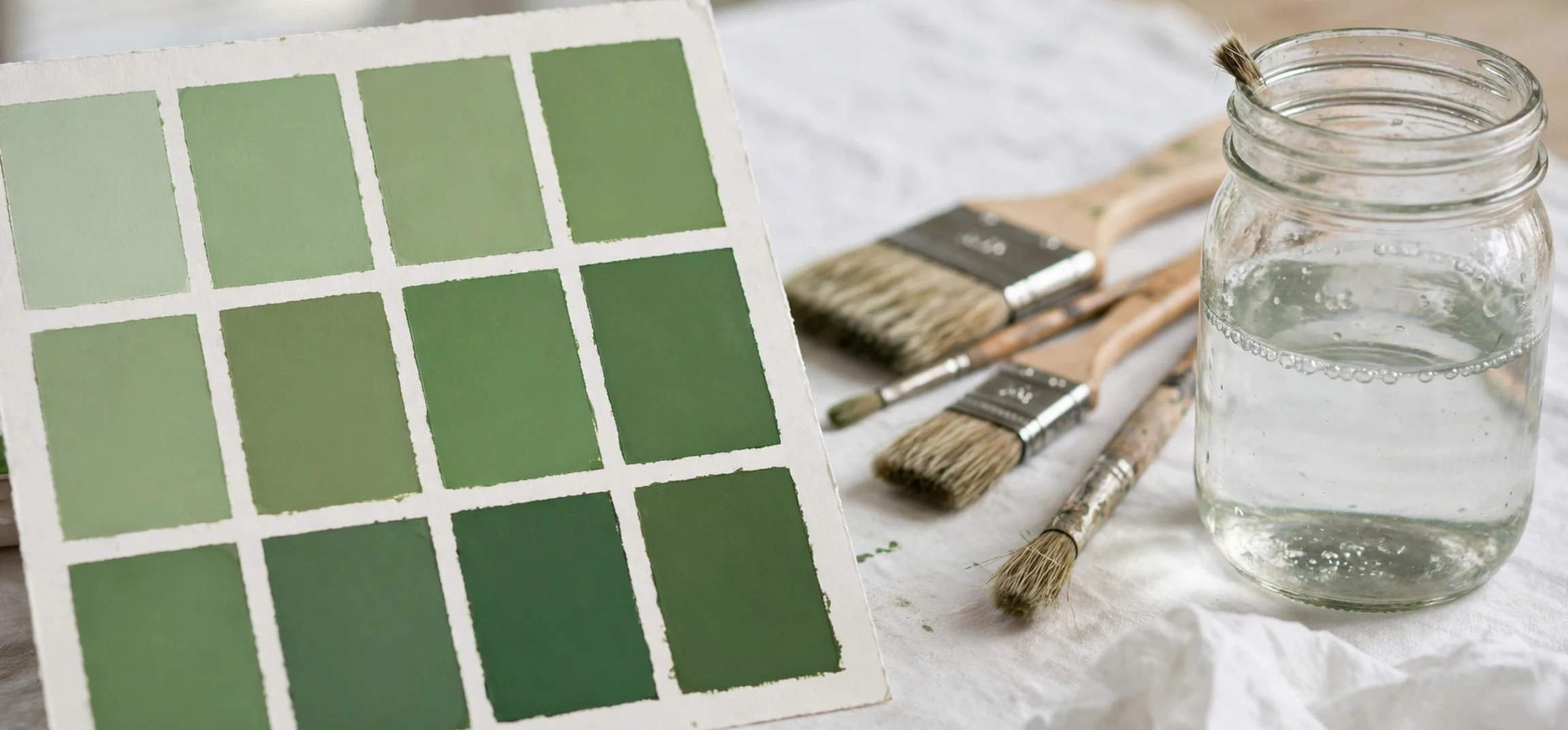
If you love soft, fresh greens, the phrase shades of mint green names is the key to finding the exact colour you picture, because mint green is not one colour at all, but a family of pale, cool greens with a hint of blue. This guide collects shades of mint green names in plain language, explains how they differ, and shows how retro and classic design has used them for decades, from 1950s kitchens to modern bedrooms, wedding palettes, and branding. Whether you are choosing wall paint, a dress, a website palette, or a craft project, knowing the right name helps you search accurately, compare swatches, and describe your choice to a painter, a designer, or a shop assistant without confusion.
Mint green itself sits between green and blue-green on the colour wheel, lightened with plenty of white so that it feels airy rather than deep or forest-like. Its fresh, clean feeling comes from that lightness: it suggests mint leaves, spring growth, cool water, and freshly laundered linen, without the intensity of a saturated green. The shades of mint green names below range from very pale, almost white greens to richer, more saturated mint tones that still read as mint because of their cool, blue-leaning character. The same name can vary slightly between paint brands, fabric ranges, and digital colour systems, so always compare a physical swatch or a printed sample in your own light before committing, and treat any hex code in this guide as a typical reference rather than a brand standard.
Shades of Mint Green Names: The Core List
The best-known of the shades of mint green names is simply Mint, a light, cool green that most people picture first. Close to it is Spearmint, slightly deeper and fresher, named for the herb and often used for packaging, confectionery branding, and spring clothing. Seafoam is another essential name, a pale green with a stronger blue and grey influence, like foam at the edge of the sea, and it is a favourite for coastal and retro interiors. Pastel Mint is a very light, soft version, popular for nurseries, wedding stationery, and delicate knitwear, while Mint Cream is even paler, almost off-white with a green whisper, ideal for walls in small rooms where a stronger colour would feel heavy. Together, these five names cover most everyday uses, and learning them alone will solve most colour searches.
Beyond the core five, the family widens in useful ways. Peppermint is a brighter, cleaner mint, often used for candy branding and for modern, playful design. Wintergreen is a slightly deeper, cooler mint with a hint of blue, named for the wintergreen plant and often seen in vintage packaging. Eucalyptus is a muted, grey-green mint, more sophisticated and natural, popular for wedding palettes and for calm, adult interiors. Jade Mint is a richer mint that leans toward jade, giving a more jewel-like feel while keeping the cool freshness of mint. Celadon, a historic pale green named for a type of Chinese glaze, overlaps with mint in its palest forms and is prized in ceramics and classic design. Each of these shades of mint green names carries a slightly different mood, so the right choice depends on whether you want freshness, calm, nostalgia, or luxury.
Shades of Mint Green Names in Retro and Classic Design
Retro design is where mint green earned its classic status. In the 1950s, mint green appeared on kitchen appliances, bathroom tiles, Formica counters, and diner interiors, paired with cream, chrome, pink, and soft yellow to create a cheerful, optimistic look. That mid-century palette still influences modern retro kitchens, where a mint refrigerator or mint cabinets instantly signal nostalgia without feeling dated, especially when paired with clean lines and modern appliances. In classic interiors, mint green works differently: it appears as a soft wall colour in bedrooms and bathrooms, as a painted furniture finish, and as a fabric colour for curtains and upholstery, where its calm, airy quality suits traditional rooms. The shades of mint green names that suit retro work best are often the slightly stronger ones, such as Spearmint and Seafoam, while classic rooms often favour paler versions such as Mint Cream and Pastel Mint.
Classic fashion also returns to mint again and again. Mint dresses, suits, and accessories appear in spring collections because the colour flatters many skin tones in its pale forms and photographs beautifully outdoors. In weddings, mint is a popular bridesmaid colour, a stationery colour, and a table decoration colour, because it pairs gracefully with white, ivory, blush, gold, and grey. In branding, mint signals freshness, cleanliness, and calm, which is why it appears for health, beauty, food, and wellness brands, often with white and a darker green for contrast. Understanding the retro and classic history of mint helps you choose with confidence: you are not following a passing trend, but using a colour family that has been loved for generations, and that familiarity makes it feel timeless rather than fashionable for a single season.
How to Tell Mint Shades Apart
Telling mint shades apart is easier when you check three qualities: lightness, blueness, and greyness. Lightness asks how pale or deep the colour is, from near-white Mint Cream to deeper Jade Mint. Blueness asks how much the green leans toward blue, with Seafoam and Wintergreen leaning more blue than a pure Mint, while Spearmint leans more toward a true green. Greyness asks how muted the colour feels, with Eucalyptus and Celadon feeling greyer and more natural than bright Peppermint. Hold swatches together in daylight, not only under shop lighting, and view them against the white, wood, or fabric they will sit beside, because mint changes noticeably with its neighbours. A mint that looks fresh beside white may look grey beside dark wood, and a mint that looks pale on a screen may look stronger on a wall.
Digital colour work needs the same care. On screen, mint shades are defined by hex codes and RGB values, but screens differ in brightness and colour settings, so a code is a starting point, not a guarantee. If you are designing a website or a social media graphic, test your mint palette on both light and dark backgrounds, check text contrast for readability, and pair mint with a darker green or charcoal for text rather than using mint for text itself. For print, request a printed proof, because a mint that looks perfect on screen can print greyer or bluer depending on paper and ink. For paint, buy a sample pot and paint a large test patch, then live with it for a few days in morning and evening light before buying full tins. These practical steps matter more than any single name, and they are how designers avoid the common disappointment of a mint that looked right in the shop but wrong at home. For related colour reading, see our guide to names of different blue colours, analogous colours explained, and a general colour guide.
Shades of Mint Green Names: A Pairing Guide
Mint green pairs beautifully with a wide range of colours, and the pairing you choose changes its character completely. With white and cream, mint feels clean, airy, and spa-like, ideal for bathrooms and bedrooms. With blush pink and soft peach, mint feels retro and sweet, recalling 1950s diners and vintage fashion. With navy and charcoal, mint feels modern and crisp, because the dark colour anchors the pale mint and stops it feeling washed out. With gold and brass, mint feels elegant and classic, suitable for weddings and formal interiors. With coral and soft yellow, mint feels playful and summery, perfect for children’s rooms, packaging, and seasonal design. With grey, especially warm grey, mint feels calm and sophisticated, a favourite for offices and contemporary homes. Avoid pairing mint with too many other pastels at once, or the palette can feel unfocused; choose one mint, one neutral, and one accent, and let the mint lead.
Seasonal use also guides pairing. In spring, mint with white, blossom pink, and light wood feels fresh and natural. In summer, mint with sea blue, sand, and white feels coastal and relaxed. In autumn, mint with cream, sage, and warm wood feels softer and more muted, especially in its greyer forms such as Eucalyptus. In winter, mint with silver, white, and deep green feels festive without the usual red and green intensity, and it works well for holiday cards and table settings. These seasonal ideas are starting points, not rules, and the best palette is the one that feels right in your own space and light. The shades of mint green names give you the vocabulary to explore those palettes, but your eye, tested with real swatches, should make the final choice.
| Shade name | Typical character | Best for |
|---|---|---|
| Mint | Light, cool, classic mint | Walls, clothing, general design |
| Spearmint | Fresher, slightly deeper mint | Branding, spring fashion, kitchens |
| Seafoam | Pale green with blue and grey | Coastal and retro interiors |
| Pastel Mint | Very light, soft mint | Nurseries, weddings, stationery |
| Mint Cream | Near-white with a green whisper | Small rooms, ceilings, trim |
| Peppermint | Brighter, cleaner mint | Playful packaging and modern design |
| Eucalyptus | Muted, grey-green mint | Calm interiors and wedding palettes |
| Celadon | Historic pale green glaze tone | Ceramics and classic design |
Frequently Asked Questions
What are the most popular shades of mint green names? Mint, Spearmint, Seafoam, Pastel Mint, and Mint Cream are the most widely used shades of mint green names, with Peppermint, Eucalyptus, and Celadon as popular variations.
Is mint green the same as sage green? No. Mint is cooler, lighter, and bluer, while sage is greyer and more muted, with a stronger grey and earth influence.
Does mint green suit small rooms? Yes, especially in its palest forms, because light mint reflects light and feels airy, but test a sample in your own light first.
What colours go best with mint green? White, cream, blush, navy, gold, grey, and coral all pair well, depending on whether you want a retro, classic, modern, or playful feel.
Shades of Mint Green Names: Choosing Yours
Choosing among the shades of mint green names is easiest when you narrow to three candidates and test them side by side. Pick one pale option, such as Mint Cream, one classic option, such as Mint, and one stronger option, such as Spearmint or Seafoam, and compare them in your room or against your fabric in daylight. The shades of mint green names list in this guide is designed for that test: each name points to a distinct character, so your shortlist will cover lightness, blueness, and greyness without duplication. Once you have a favourite, test it at full size before committing, because a small swatch can mislead. Remember that shades of mint green names vary slightly by brand, so keep the brand and code with your final choice for future touch-ups or matching items.
Conclusion
The shades of mint green names collected here, from Mint and Spearmint to Seafoam, Pastel Mint, Mint Cream, Peppermint, Eucalyptus, and Celadon, give you a clear vocabulary for a colour family that has been loved in retro and classic design for generations. Knowing the names helps you search accurately, compare swatches with confidence, and describe your choice clearly, whether you are painting a room, choosing a dress, planning a wedding, or building a brand palette. Test real samples in your own light, pair mint with one neutral and one accent, and let the freshness and calm of this timeless green do the rest. Mint green endures because it feels both nostalgic and new, and that balance is exactly why it remains a classic.