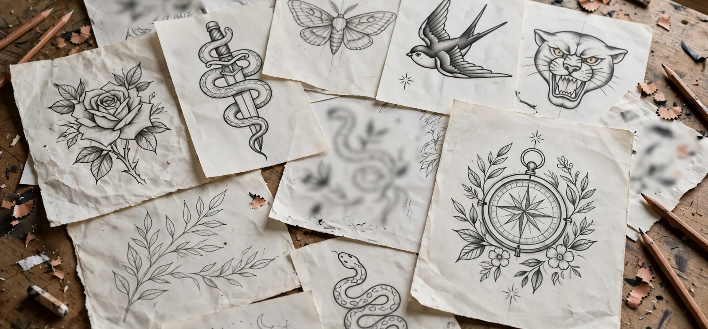
Choosing lettering name tattoo designs is a deeply personal decision, because a name tattoo is not just decoration. It is a visible statement about love, memory, identity, or family, and the lettering style you choose will shape how that statement is read for years to come. From elegant script and classic serif lettering to bold arcade-inspired styles with bright colour, chunky outlines, and playful energy, there are countless ways to turn a single name into a piece of art. This guide explores the most popular lettering approaches, explains how to choose a style that suits the name and the placement, and offers practical advice on working with a tattoo artist, checking spelling, and caring for lettering so it stays clear and readable over time.
The arcade feel mentioned in the title refers to a specific mood: the bright, confident, slightly retro energy of classic arcade games, neon signs, and bold display type. Think thick letters, strong shadows, vivid colour blocks, and a sense of fun. That style suits people who want their name tattoo to feel lively rather than formal. It works especially well for short names, nicknames, and names that will sit on the forearm, calf, or upper arm, where larger letters have room to breathe. However, arcade lettering is only one option. The best design is the one that matches the personality of the person named, the meaning behind the tattoo, and the wearers everyday style, not simply the trend of the moment.
What Are Lettering Name Tattoo Designs?
Lettering name tattoo designs are tattoos in which the name itself is the main artwork. Unlike portrait tattoos or symbol tattoos, the letters carry the meaning, so typography becomes the most important creative choice. The artist must consider the shape of each letter, the spacing between letters, the weight of the strokes, and how the whole name flows across the skin. A long name needs a different approach from a short name. A name with many curved letters, such as those with rounded shapes, may suit script, while a name with strong straight letters may suit block or gothic styles. Good lettering looks balanced from a distance and remains legible up close.
There are several broad families of lettering. Script lettering connects letters in a flowing, handwritten style and feels romantic, elegant, or personal. Serif lettering uses small finishing strokes at the ends of letters and feels classic, timeless, and formal. Sans-serif lettering is clean and modern, with no extra strokes, and feels simple and bold. Block lettering is thick and strong, often used for statement pieces. Gothic or blackletter styles feel dramatic and traditional, with dense, ornate shapes. Hand-lettered and custom styles blend these families, allowing an artist to create something unique for one name. Understanding these families helps you describe what you want clearly when you visit a studio.
Why Lettering Matters More Than Decoration
With a picture tattoo, a small flaw in shading may go unnoticed. With lettering, a single misplaced stroke can change a letter or make a word hard to read. That is why lettering tattoos demand a skilled artist with a strong portfolio of text work. Before booking, look for healed photos, not only fresh tattoos, because fresh ink always looks sharp. Healed lettering shows whether lines stayed crisp, whether small letters blurred, and whether the artist understands how ink spreads slightly under the skin over time. Ask to see examples in the style you want, and be honest if a design looks too small or too detailed for the placement you have chosen.
Placement also affects lettering. Skin stretches and moves, and areas that bend often, such as the wrist or elbow, can distort letters. Flat areas such as the forearm, upper arm, chest, and calf usually hold lettering well. Very small lettering on fingers or behind the ear may look delicate at first but can fade or blur faster, because the skin there is thin and constantly used. A good artist will warn you about these risks and suggest a size that protects legibility. It is better to choose a slightly larger design than to insist on tiny letters that become unreadable within a few years.
Lettering Name Tattoo Designs With an Arcade Feel
Lettering name tattoo designs with an arcade feel borrow their energy from retro gaming, neon signage, and bold poster type. The letters are usually thick, rounded, or slightly angled, with strong outlines and a drop shadow or layered colour effect that makes them pop from the skin. Colour is a key feature: bright reds, electric blues, sunny yellows, and vivid greens can be combined to create a playful, high-energy look. Some designs add small details such as stars, dots, lightning bolts, or pixel-style accents, but the name should always remain the star. If decorative elements compete with the letters, the design loses clarity.
Arcade lettering works best for short to medium names, because long names in thick block letters need a lot of space. If the name is long, consider stacking it over two lines, using a curved layout along the arm, or choosing a slightly narrower arcade font that still feels bold. Another option is to use arcade lettering for a nickname or initials, and add the full name in a simpler style elsewhere. That approach keeps the playful energy without forcing a long name into a cramped space. Always ask the artist to print the design at full size and place it on your skin with a stencil before tattooing, so you can check the flow, size, and readability from a normal distance.
Colour, Shadow, and Outline Choices
Outline thickness determines how well arcade lettering ages. A bold outline helps the design hold its shape as ink settles, while very thin outlines may fade faster. Shadows add depth, but they should be consistent. A shadow that falls in different directions on different letters will look accidental. Colour choice also matters for long-term appearance. Bright colours can fade faster than black, especially with sun exposure, so daily sun protection helps preserve colour. Some people choose black arcade lettering with one accent colour, which gives a bold look with easier touch-ups. Others prefer full colour for maximum impact and accept that occasional touch-ups may be needed.
Font selection should reflect the person being honoured. A playful arcade style suits a joyful tribute, a nickname from childhood, or a name connected to gaming and pop culture. It may feel less suitable for a solemn memorial, where a classic serif or gentle script may feel more respectful. There is no rule that forbids mixing moods, but thinking about the emotional tone helps you avoid regret. Ask yourself how you want to feel when you see the tattoo in ten years. If the answer is cheerful and energetic, arcade lettering is a strong choice. If the answer is calm and timeless, a more traditional style may serve you better.
Popular Lettering Styles Compared
Script lettering is the most popular choice for name tattoos, because it feels personal and handwritten. It works well for first names, especially on the wrist, collarbone, and forearm. However, highly decorative script can be hard to read, particularly if letters are looped or joined in unusual ways. If you choose script, make sure every letter is clear to someone who does not already know the name. Typewriter lettering offers a different mood: neat, honest, and slightly vintage, with even spacing that suits quotes and dates alongside a name. Minimalist sans-serif lettering suits people who prefer a clean, modern look and want the name to speak without decoration.
Gothic lettering creates a dramatic, old-world feel and is often chosen for family names, surnames, or names with historical significance. It looks powerful in large pieces across the chest or back, but it can be difficult to read at small sizes. Old English and calligraphy styles sit between script and gothic, offering elegance with structure. Hand-drawn custom lettering, where the artist designs each letter from scratch, is the most personal option, but it also requires the most trust in the artist. Whichever style you choose, request a clean digital or hand-drawn proof, check it letter by letter, and take a photo of it to review at home before your appointment.
| Lettering Style | Best For | Things to Watch |
|---|---|---|
| Arcade and bold block | Short names, playful tributes, forearm and calf pieces | Needs space; long names may need two lines |
| Script and calligraphy | Elegant first names, romantic or family tributes | Very fancy loops can reduce readability |
| Serif and classic | Timeless memorials and formal names | Small serifs can blur if the size is too small |
| Sans-serif and minimalist | Clean modern names and small placements | Tiny letters may fade faster on hands and fingers |
| Gothic and blackletter | Large statement pieces and surnames | Hard to read at small sizes; needs an experienced artist |
Choosing the Right Name and Placement
Before you settle on a design, think carefully about which name to tattoo. Many people choose a child, partner, parent, or close family member, while others choose their own name as a statement of identity. Some choose a name in another language or script, which adds beauty but also adds risk. If the name uses characters you cannot read, have it checked by a fluent speaker and by the artist, and confirm the spelling in writing. A mistake in a name tattoo is far more noticeable than a mistake in a decorative design, so triple-check every letter, accent, and capitalisation before the needle touches skin.
Placement should follow the length and style of the name. The forearm is popular because it is flat, visible, and easy to show or cover with a sleeve. The upper arm offers more space for larger arcade lettering. The chest works well for names placed over the heart, while the back allows long names or names combined with larger artwork. The wrist and ankle suit short names in script, but they require careful sizing. Consider your work, lifestyle, and future plans as well. A visible name tattoo is a commitment, and while cover-ups and removal exist, they are costly and rarely perfect. Choose a placement you will be comfortable with in professional and personal settings alike.
Adding Dates, Symbols, and Small Details
Many name tattoos include a date, a small heart, a star, an infinity symbol, or a simple floral accent. These details can add meaning without overwhelming the letters. Keep additions simple and balanced. A date in clean, small type below the name often works better than a date woven through the letters. A single accent, such as a small star at the end of an arcade design, can complete the look. Too many additions, however, create clutter and draw attention away from the name. If you are unsure, ask the artist to show you two versions: one with details and one without. Comparing them side by side usually makes the better choice obvious.
For readers interested in tattoo meanings more broadly, our guide to symbolic designs is a useful companion: 888 tattoo meaning guide. You may also like name tattoos behind the ear guide and Samoan tattoos with meaning guide, which explore placement and cultural context for different tattoo styles.
Working With a Tattoo Artist
A good consultation is the most important step in the whole process. Bring reference images, but be clear about what you like in each one: the thickness of the letters, the colour palette, the spacing, or the overall mood. Tell the artist the exact spelling, including capitals and any special characters, and write it down rather than relying on memory. Discuss size, placement, pain level, healing time, and cost openly. A reputable studio will be clean, licensed where required, and happy to explain its hygiene practices, including single-use needles and proper aftercare instructions.
Do not rush the design approval. If the stencil looks wrong on your skin, say so. A slight curve, a letter that looks crowded, or a colour that feels too bright can all be adjusted before tattooing begins, but not easily afterwards. Ask the artist how the design will age, whether the size is safe for the placement, and whether any letters need more spacing. An experienced lettering artist will welcome these questions, because they show that you care about the result. If an artist dismisses your concerns or refuses to show healed work, consider visiting another studio.
Aftercare for Lettering Tattoos
Aftercare protects both the ink and the clarity of the letters. Follow your artist instructions closely, but general guidance includes keeping the tattoo clean, washing gently with mild soap and water, patting dry rather than rubbing, and applying a thin layer of recommended moisturiser. Avoid soaking the tattoo in baths, pools, or the sea until it is fully healed, and avoid picking at scabs, because picking can pull ink out and damage fine lines. Sun exposure is the main long-term enemy of colour and clarity, so use sun protection once the tattoo has healed and avoid prolonged direct sun on fresh ink.
Healing usually takes a few weeks for the surface, with full settling over a longer period. During healing, lettering may look slightly cloudy or raised, which is normal. If you notice unusual redness, swelling, or signs of infection, seek advice from a clinician promptly rather than waiting. Once healed, check the tattoo in natural light. Small touch-ups are common for lettering, especially for fine script or bright colour, and many studios offer a touch-up within a set period. Keep a note of the inks and colours used, so future touch-ups match the original design.
Frequently Asked Questions
What is the most readable lettering style for a name tattoo?
Bold block, clean sans-serif, and well-spaced serif lettering are usually the most readable. Script can also be readable if the loops are clear and the size is generous. The key is size and spacing: larger letters with clear gaps between them stay readable far longer than tiny, tightly packed letters.
How do I avoid spelling mistakes?
Write the name down, check it against an official source such as a birth record or identity document where appropriate, and ask a second person to check it as well. Confirm the spelling with the artist in writing, and check the stencil on your skin letter by letter before tattooing begins.
Does arcade lettering suit every name?
Arcade lettering suits short, energetic names best, but it can be adapted for longer names by stacking lines, curving the layout, or using a narrower bold font. Discuss the full name with your artist, and be open to adjusting the layout so the design stays clear and balanced.
Conclusion
Lettering name tattoo designs offer a beautiful way to honour a person, celebrate an identity, or carry a meaningful name with you every day. Whether you choose playful arcade lettering with bright colour and bold outlines, elegant script, classic serif, or a custom hand-lettered design, the principles remain the same: choose a skilled lettering artist, prioritise readability, check spelling carefully, pick a placement that suits the size, and care for the tattoo as it heals. Take your time, compare designs, and trust your instincts. A name tattoo chosen with care will feel just as meaningful in ten years as it does on the day you get it.