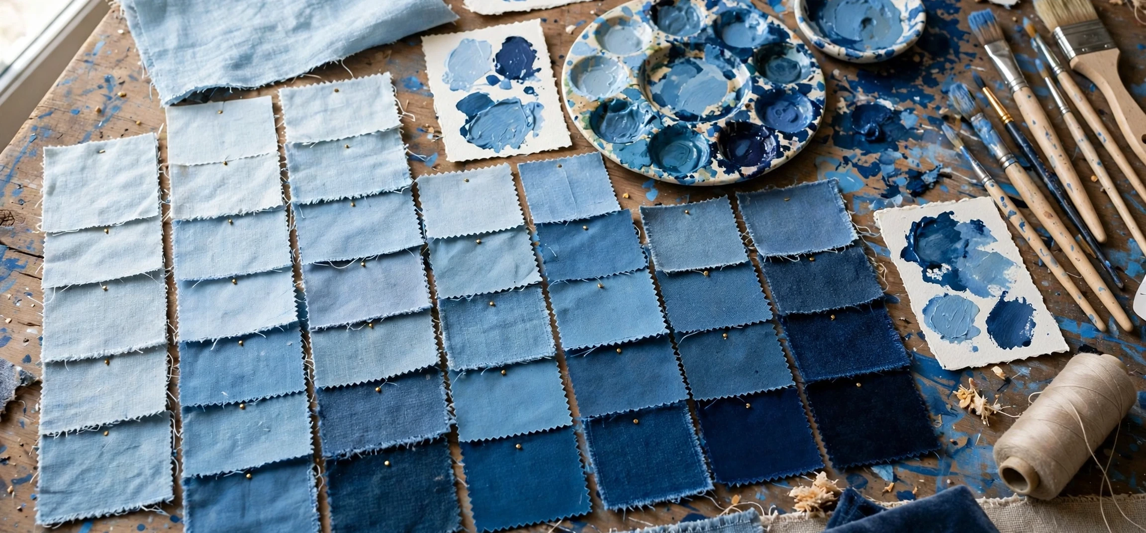
Blue is one of the most loved colours in the world, yet most people use only a handful of words for it: light blue, dark blue, and maybe navy. In reality, the names of types of blue run into the dozens, from the pale hush of baby blue to the deep drama of midnight blue, and each shade carries its own mood, history, and best use. Whether you are choosing paint, designing a website, picking an outfit, or simply trying to describe the exact blue you have in mind, knowing the right names makes the difference between a vague idea and a precise choice. This guide walks through the most useful blue shades, grouped by family, with notes on what each one feels like and where it works best.
Blue earns its popularity for good reasons. It is associated with sky and sea, with calm and trust, with depth and distance. Designers use it for brands that want to feel reliable. Painters use it for shadows, water, and evening skies. Fashion uses it because it flatters almost everyone and pairs with almost everything. Yet that versatility can also make blue feel generic when the shade is wrong. A bright electric blue shouts energy, while a dusty slate blue whispers understatement, and using one where the other belongs changes the whole result. Learning the names of types of blue is therefore a practical skill, not just a vocabulary exercise.
Pale and Soft Blues: Baby Blue, Powder Blue, and Ice Blue
Among the names of types of blue, pale blues are gentle, airy, and calming. Baby blue is the softest and sweetest of the family, a light pastel blue with a hint of warmth, long associated with nurseries, spring clothing, and delicate design. Powder blue is slightly dustier and more muted, a classic choice for shirts, bedding, and interiors that want to feel clean without feeling cold. Ice blue is paler and cooler still, almost silvery, like light reflected off frozen water, and it works beautifully in modern, minimal spaces.
These pale shades share a common strength: they open up a room, an outfit, or a page. In interiors, pale blue walls make small rooms feel larger and brighter. In clothing, pale blue is easy to wear and easy to pair, working with white, grey, beige, and denim. In design, pale blue backgrounds feel fresh and uncluttered, which is why they appear so often in health, wellness, and technology branding. Their weakness is that they can wash out in poor light or look insubstantial on their own, so they usually need a deeper blue, a warm neutral, or a crisp white nearby to give them shape.
Periwinkle sits at the edge of this family, a pale blue with a lavender lean that feels dreamy and slightly romantic. It is a favourite for weddings, spring fashion, and illustration, where its soft purple-blue blend adds interest without losing the calm of blue. If baby blue feels too sweet and powder blue feels too plain, periwinkle is often the answer.
Bright and Classic Blues: Sky Blue, Royal Blue, and Cobalt Blue
Among the names of types of blue, bright blues are confident and clear. Sky blue is the colour of a clear midday sky, vivid but not harsh, and it is one of the most universally liked shades in the whole blue family. It feels open, friendly, and optimistic, which makes it a safe choice for everything from casual shirts to children rooms to cheerful branding. Azure is a close cousin, slightly deeper and more intense than sky blue, with a Mediterranean feel that suits summer clothing, travel imagery, and coastal interiors.
Royal blue is richer and more formal. It is a deep, saturated blue with a sense of occasion, long linked to ceremony, uniforms, and formal wear. A royal blue dress or suit commands attention without shouting, and royal blue in branding signals confidence and tradition. Cobalt blue is even more intense, a brilliant, almost electric blue named after the pigment used in glass and ceramics. It is a favourite in art and design when a bold accent is needed, because a small amount of cobalt goes a long way.
Cerulean sits between sky blue and cobalt, a vivid blue with a hint of green that feels fresh and modern. It became famous as a fashion and design colour precisely because it is striking without being aggressive. Electric blue pushes brightness further still, a neon-leaning shade that suits sportswear, nightlife, and digital design, where maximum visibility is the goal. These bright blues are the extroverts of the family: use them where you want energy, clarity, and attention.
Names of Types of Blue: Deep and Dark Blues
Deep blues are the most formal and grounding shades. Navy blue is the workhorse of the family, a very dark blue that functions almost like a neutral. It pairs with white, gold, red, and grey, it flatters in suits, uniforms, and interiors, and it rarely looks wrong. Because it is so dark, navy can read as almost black in low light, which gives it a sober, authoritative quality that lighter blues cannot match.
Midnight blue is darker and more mysterious than navy, a blue so deep it feels like the night sky just after sunset. It is a favourite for evening wear, luxury branding, and dramatic interiors, where its depth creates a sense of richness and intimacy. Indigo is a deep blue with a violet lean, named after the dye that coloured denim for centuries. It feels historic and slightly moody, and it bridges the gap between blue and purple in a way that adds complexity to any palette.
Sapphire blue brings a jewel-like quality to the deep family, a rich, luminous dark blue inspired by the gemstone. It is often used for statement pieces, from jewellery to evening gowns, because it catches the light in a way that flat dark blues do not. Understanding the names of types of blue in this deep range matters most when the difference between navy, midnight, and indigo would otherwise be lost, because each one changes the mood of a room or an outfit in a distinct way.
Blue-Green and Grey Blues: Teal, Turquoise, and Slate Blue
Some of the most interesting names of types of blue live at the borders with other colours. Teal is a dark blue-green, named after the duck whose head carries that striking colour. It feels sophisticated and slightly exotic, and it works well in interiors, branding, and fashion where a plain blue would feel too predictable. Turquoise is brighter and lighter, a vivid blue-green inspired by the gemstone and by tropical seas. It feels fresh, playful, and summery, and it pairs beautifully with coral, gold, and white.
Steel blue is a grey-blue, muted and professional, like the colour of polished metal under a cloudy sky. It is a favourite for corporate branding, menswear, and modern interiors, because it feels calm and competent without feeling cold. Slate blue is similar but softer and dustier, a blue-grey that feels natural and understated. Denim blue deserves a mention too: the familiar mid-blue of jeans, slightly faded and casual, which has become a colour in its own right after decades of everyday wear.
Cornflower blue is a lighter, softer blue with a gentle floral feel, named after the flower. It is cheerful without being loud, and it suits spring fashion, cottage interiors, and illustration. Together, these borderland blues show why a simple light-versus-dark split is never enough: the most useful shade is often the one that leans slightly toward green, grey, or purple.
A Quick Reference Table of Blue Shades
The table below gathers the main shades from this guide, with a short description and a typical use for each. Keep it handy the next time you need to name, buy, or design with a particular blue.
| Shade name | Character | Best used for |
|---|---|---|
| Baby blue | Soft, sweet, pale pastel | Nurseries, spring fashion, gentle design |
| Sky blue | Clear, bright, open | Casual wear, cheerful rooms, friendly branding |
| Royal blue | Rich, formal, saturated | Formal wear, ceremony, confident branding |
| Cobalt blue | Brilliant, intense, bold | Art accents, ceramics, statement design |
| Navy blue | Very dark, near-neutral | Suits, uniforms, classic interiors |
| Midnight blue | Deepest, mysterious, night-like | Evening wear, luxury, dramatic rooms |
| Teal | Dark blue-green, sophisticated | Interiors, branding, elegant fashion |
| Turquoise | Bright blue-green, tropical | Summer fashion, coastal design, jewellery |
| Steel blue | Muted grey-blue, professional | Corporate branding, menswear, modern rooms |
| Periwinkle | Pale blue with a lavender lean | Weddings, spring palettes, illustration |
Names of Types of Blue: How to Choose the Right Shade
Choosing well starts with the feeling you want. For calm and space, go pale: baby blue, powder blue, or ice blue. For energy and clarity, go bright: sky blue, azure, or cobalt. For authority and formality, go deep: navy, midnight, or sapphire. For something distinctive, go to the borders: teal, turquoise, or steel blue. That simple framework narrows dozens of names of types of blue down to a shortlist in seconds, and from there you can test swatches in real light, against real fabrics, or on real screens.
Light matters enormously. A blue that looks perfect in a shop or on a screen can look very different in a north-facing room or under warm evening light. Always test paint swatches on the actual wall, view fabric in daylight, and check digital colours on more than one device before committing. Pairing matters too: pale blues need a deeper anchor, deep blues need a lighter contrast, and bright blues need a neutral nearby to stop them overwhelming the whole design. White, cream, grey, and warm wood tones are reliable partners for almost every blue.
Finally, trust the name. When you can say cobalt instead of bright blue, or slate instead of greyish blue, you communicate precisely with painters, designers, printers, and retailers, and you are far more likely to get exactly the shade you imagined. That precision is the real payoff of learning blue shade names: fewer mistakes, fewer returns, and results that match the picture in your head.
Frequently Asked Questions
What is the difference between navy blue and midnight blue?
Navy blue is a very dark blue that works almost like a neutral, while midnight blue is darker and more mysterious, with a night-sky depth that suits evening wear and luxury design.
Is teal a blue or a green?
Teal sits on the border between the two. It is usually described as a dark blue-green, so it belongs in both families, which is part of why it feels so distinctive.
Which blue is best for a small room?
Pale blues such as baby blue, powder blue, and ice blue make small rooms feel larger and brighter, especially paired with white trim and good lighting.
What blue goes best with gold?
Deep blues such as navy, midnight, and royal blue pair beautifully with gold, because the warm metal contrasts with the cool depth of the blue.
Conclusion
From baby blue to midnight blue, from cobalt to teal, the names of types of blue give you a precise language for one of the most versatile colours there is. Pale blues calm and open up a space, bright blues energise and clarify, deep blues ground and formalise, and borderland blues such as teal and turquoise add character where plain blue would feel predictable. Next time you choose paint, plan an outfit, or design a page, reach past light blue and dark blue and name the exact shade you mean. The result will be closer to what you imagined, easier to explain to others, and far more satisfying to live with. For more naming and guide inspiration, see our names guide, our curated names list, and our character names guide.