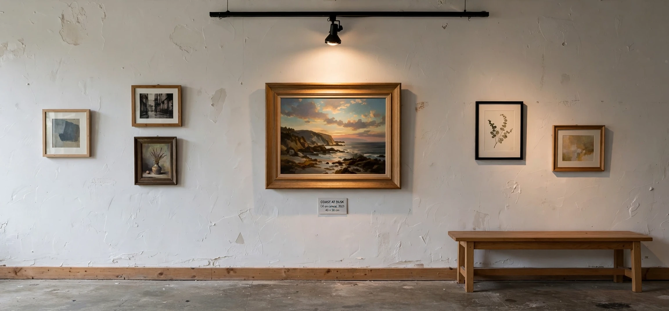
If you are looking for the emphasis in art meaning, this guide explains it clearly. In art, emphasis is the principle that makes one part of a work stand out more than the rest, guiding the eye to what matters most. Every strong artwork has a focal point, whether it is a face in a portrait, a bright shape in an abstract painting, or a single figure in a busy scene, and emphasis is the set of choices an artist uses to create that focal point.
Understanding the emphasis in art meaning helps you look at art with more confidence. Instead of wondering where to look first, you can notice how size, colour, contrast, placement, and detail work together to direct your attention. It also helps if you make art yourself, because emphasis turns a collection of elements into a composition with a clear message. Without emphasis, a work can feel flat or confusing, even when its technique is skilled.
What Emphasis in Art Meaning Really Means
The emphasis in art meaning can be summed up in one sentence: emphasis is the creation of a centre of interest in a work of art. Artists use emphasis to say, in visual language, start here. That starting point might be the most important subject, the emotional heart of the work, or the detail that unlocks the rest of the composition. Everything else supports that point, even when it is interesting in its own right.
Emphasis is closely related to other principles of art, such as balance, contrast, unity, and movement. Contrast often creates emphasis, because a bright shape among dark shapes naturally draws the eye. Balance keeps emphasis from feeling accidental, because the rest of the composition is arranged to support the focal point rather than compete with it. Movement then carries the eye from the focal point through the rest of the work, so the viewer experiences the artwork in a sequence rather than all at once.
How Artists Create Emphasis in Art
Artists create emphasis in many ways, and they often combine several techniques at once. Size is one of the simplest: a larger figure or shape tends to dominate smaller ones. Colour is another powerful tool, because a vivid colour among muted tones, or a warm colour among cool colours, immediately attracts attention. Value, meaning lightness and darkness, works in a similar way, with a bright area on a dark ground standing out clearly.
Placement also matters. A subject placed near the centre, or isolated from a group, gains importance. Detail works the same way: a sharply rendered face among loosely painted surroundings invites a closer look. Artists may also use lines to point toward a focal point, or use repetition to create a pattern that is broken by one different element. That break, sometimes called an anomaly, is a classic emphasis technique, because the eye notices what does not fit the pattern.
Emphasis in Art Meaning With Familiar Examples
Consider a portrait. The face is usually the focal point, created through detail, contrast, and placement, while clothing and background remain simpler. In a landscape, emphasis might fall on a single tree, a building, or a shaft of light, while the rest of the scene provides context and atmosphere. In abstract art, emphasis might be a bold shape, a strong colour, or a thick line that anchors an otherwise free composition.
Photography uses the same principle. A photographer may use shallow focus to keep one subject sharp while the background blurs, or use leading lines such as a road or a fence to guide the eye toward a person. Graphic design works similarly: a headline is larger and bolder than body text, and a call to action button uses a contrasting colour so that it stands out. In each case, emphasis answers the same question: what should the viewer notice first, and why?
Why Emphasis in Art Matters for Viewers and Makers
For viewers, the emphasis in art meaning explains why some artworks feel instantly clear while others feel busy. When emphasis is strong, you know where to begin, and the rest of the work unfolds around that point. When emphasis is weak or divided, you may feel unsure where to look, and the work can feel less satisfying even if you cannot immediately say why. Learning to spot emphasis therefore makes gallery visits, art classes, and even everyday design more enjoyable.
For makers, emphasis is a practical decision, not just a theory. Before finishing a work, an artist can ask: what is the most important idea here, and does the composition make that idea obvious? If the answer is no, the artist can adjust size, colour, contrast, or placement until the focal point is clear. That process often improves the whole composition, because supporting elements are simplified or rearranged to serve the main idea rather than competing with it.
| Topic | What to Know | Why It Matters |
|---|---|---|
| Technique | How It Works | Example |
| Size | A larger element dominates smaller ones | A large figure among small figures |
| Colour | A vivid colour stands out from muted tones | Red shape in a grey composition |
| Contrast | Light against dark draws the eye | Bright face in a dark portrait |
| Isolation | A lone element gains importance | One tree in an open field |
| Detail | Sharper detail attracts closer looking | Detailed face, loose background |
Common Mistakes When Using Emphasis in Art
One common mistake is creating too many focal points. If every element shouts for attention, none of them stands out, and the work feels noisy. A stronger approach is to choose one primary focal point and let one or two secondary points support it, with decreasing importance. Another mistake is making emphasis accidental, for example through a bright spot or a stray mark that distracts from the intended subject. Checking a work from a distance, or in a mirror, can reveal unintended focal points.
A related mistake is relying on only one technique when several would work better. Size alone may not be enough if colour and value are working against the focal point. Combining techniques, such as placing the main subject centrally, giving it stronger contrast, and simplifying its surroundings, usually creates clearer emphasis. The goal is not to make the focal point loud for its own sake, but to make the meaning of the work easy to grasp.
For more naming and meaning guides, see our article on the Seven Dwarfs names and our guide to car emblems and names. Both show how a clear focal idea, whether a character name or a badge, helps an audience remember and understand a subject. The emphasis in art meaning follows the same logic: a clear centre of interest makes everything around it easier to read.
Emphasis in Art Meaning in Everyday Design
The emphasis in art meaning is not limited to paintings in galleries. It appears in posters, websites, book covers, and advertisements, wherever a designer wants you to notice one thing first. A poster may use a large title, a bright image, and a simple background so that the event name stands out. A website may use a contrasting button so that the next step is obvious. A book cover may use a single striking image and a bold title, while the author name and reviews remain smaller. In each case, the emphasis in art meaning explains the hierarchy you feel instantly, even if you have never studied art theory.
Learning to notice the emphasis in art meaning in everyday design also makes you a more thoughtful viewer. You can ask why a particular element was made larger, brighter, or more detailed, and what that choice tells you about the message. You can also notice when emphasis is missing, for example on a cluttered poster where everything competes for attention, or on a webpage where the important action is hidden among many equal choices. That awareness is useful far beyond art class, because clear emphasis helps communication in almost every visual field, from signage to social media graphics to classroom displays.
One useful exercise for understanding the emphasis in art meaning is to cover the focal point of an artwork with your hand, or to imagine it removed, and then ask what changes. If the work suddenly feels aimless, emphasis was doing important work. If the work still feels clear, another element may be carrying emphasis, or the composition may rely on overall pattern rather than a single centre. Trying that exercise with several artworks, from portraits to posters, quickly shows how varied the emphasis in art meaning can be in practice, while the underlying idea remains the same: one part leads, and the rest supports.
Finally, remember that the emphasis in art meaning grows with practice. The more artworks you study, the faster you will spot the focal point, and the more you will appreciate how subtly an artist can guide your eye. A small shift in colour, a slight increase in size, or a careful placement can change the whole reading of a work, and noticing those choices is part of the pleasure of looking at art. The emphasis in art meaning is therefore both a viewing skill and a making skill, useful every time you look at, create, or judge a visual work.
Frequently Asked Questions
What is emphasis in art in simple terms?
The emphasis in art meaning is the principle of making one part of an artwork stand out as the focal point, so viewers know what to look at first.
What creates emphasis in art?
Size, colour, contrast, placement, detail, isolation, and lines that direct the eye can all create emphasis, often used together.
Can an artwork have more than one focal point?
Yes, but one primary focal point usually works best, with secondary points supporting it, so the composition does not feel divided or confusing.
Conclusion
In short, the emphasis in art meaning is about direction. Emphasis tells the eye where to begin, what matters most, and how the rest of the work relates to that centre. Whether you are studying a painting, taking a photograph, or designing a poster, a clear focal point turns separate elements into a coherent message. Look for size, colour, contrast, and placement next time you view art, and you will start to see emphasis working everywhere.